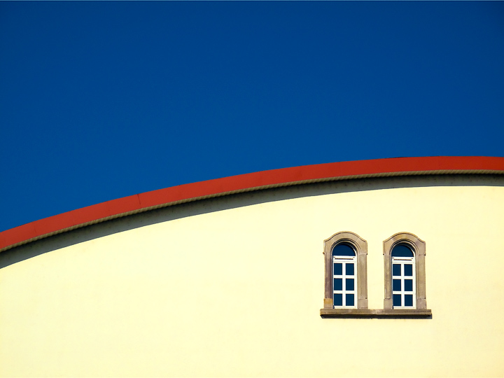
I like the composition....but, is the yellow actually that light? It looks like it may be a bit blown out...It would have been nice to see a deeper yellow in the building to add more contrast in color
OK, I'm going through the Free Study submissions, purposefully finding those images I think are shot with a less conventional eye - this is one of those images! Thanks for offering something that isn't just DPC friendly eye-candy (though of course there's nothing wrong with eye-candy). I'll be picking one of these images for my Mu (most underrated) award:
Positives: Sometimes in the comment series I comment on an image that has wider than 'just' niche appeal - I think this image begins to stray into that area. What hits me about this image is its purity, so clean uncluttered. I like the way you haven't been tempted to ramp up the saturation on the red and yellow - I'm not sure I would've made nearly such a sensible editing choice; there is a lesson for me right there. The composition is fantastic - so well balanced.
Critical stuff: Nothing much but perhaps my heavy-handed editing might have been tempted to send the window panes to black just to pick up the contrast of this area.






 Add photograph to your favorites
 Add photographer to your favorites

 Photographer found comment helpful.


