Greetings from the Critique Club...
Having a beautiful subject goes a long way towards making excellent studio-type portraits. Unfortunately, I tend to be a little harsh on studio work for several reasons. In this environment, the photographer has complete control over lighting, posing, and composition, so anything that "I", as a critique giver, find out of line is considered a mistake :) Also, keep in mind that a critique is simply an opinion of your work from another person who is biased by their own preferences and experiences...
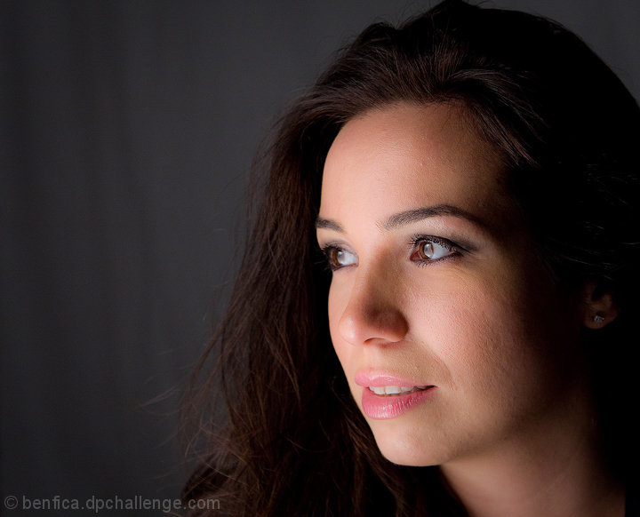
Your light in this image has created some compositional issues that jump out at me rather quickly. In a studio setting, there is no real reason to not create a lighting situation that shows some amount of detail throughout the entire subject. In this particular image, the directional lighting is strong enough (and probably from only a single direction) that it's creating a lot of loss in shadow detail in the hair and on the face towards the right side of the image. The ear and jewelry managed to find a little light, but that anatomical feature is floating in a sea of darkness. Dark hair on a dark background is almost always improved in appearance by back lighting it with a spot of some sort to create a contrasting edge. It also creates a glow that usually enhances the overall feel of the image. As for improving the lighting in this image, I think you could have salvaged the detail AND maintained the high contrast by using a reflector a few feet away to bounce just a little bit of the light source back into the dark areas of this image.
My personal common theme on offering portrait work into a photo competition such as these here at DPC is rather simple. When you provide an image like this, you need a 'hook' of some sort that intrigues the viewer into falling in love with the image when they have no personal connection with the subject. IMHO, this is a good photo, but it stops at that. What part of this photo should I find compelling in an artistic sense? What makes it above average? What gives it an artistic edge that would make me give it a score in the 8-9-10 range? She's a beautiful girl. I see hundreds of photos of beautiful girls every week. What sets this one apart from the rest?
Just some food for thought :)
|