Critique Club Review:
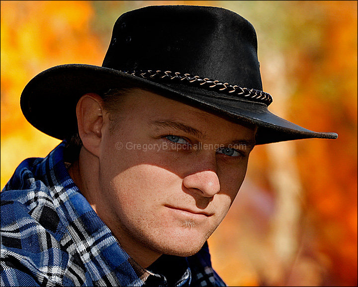
Color Saturation and Hue: Colors and Hues are realistic, nothing is over saturated. Skin tones are excellent!
Brightness and contrast: Brightness is well done, as is contrast. The black of the hat holds detail well for the most part. Near the back it gets hard to see the detail. As others have noted, the shadow does distract a bit. Where this is advanced editing, this would have been a good time to equalize a bit, to reduce the effect of the shadow, allowing a more even lighting effect.
Focus and depth of field: Focus is razor sharp. Very nicely done. Depth of field is used well to separate the subject from the background. Though the background may be a tiny bit too soft. The flames make a very nice color pattern, but I wonder if the voters, who move through images pretty quickly, never noticed the nice big fire back there. A little more background detail might have sold the fire a little better.
Subjective: Very interesting image. I had to look a bit to see the fire, but other than that and the previously mentioned shadow, this image is one that holds the viewer's gaze. Your son makes a very good model. The pose, his self assured gaze, and the clothing all work together. Very nicely done.
|