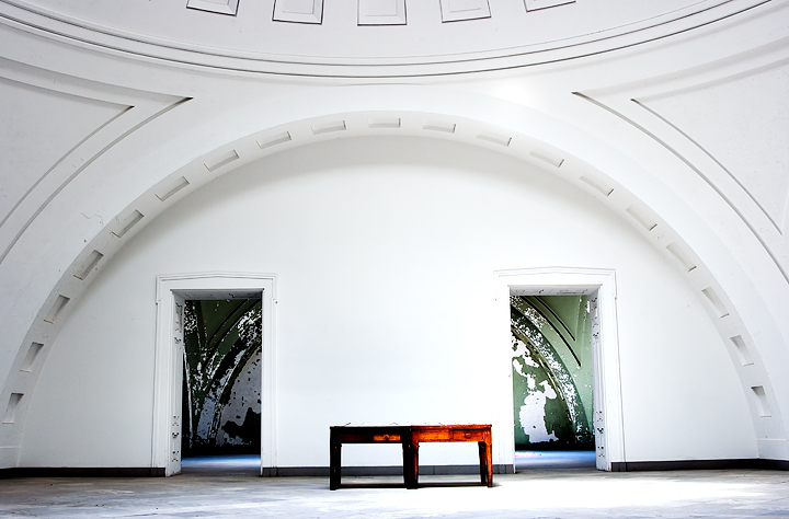
There's something about this that made me pause during voting. The not-quite-symmetry, for one thing; the table, just sorta there; but mostly the "world" in the next room, created in part by the peeling paint, in part by the blue light (the ocean, if you will). Now having read the link you provided, all of this takes on even more significance. The sheltered select few in their pristine white room, the world beyond in it's peeling and rich glory. Fascinating photograph.
The floor is off by a couple of degrees and I would more even lighting across the entire foreground (left seems slightly shadowed compared to the right), other than those I really like the composition.
I like the symmetry of the lines in this shot. However, the lighting is "off balance" if you will. The right side is a bit over exposed. Also a detractor is the crop; the symmetry is the draw to the image, but the image is tilted slightly toward the left. I think the tilt caused the curved lines to not meet in the top corners. The arch is cut off on the left side. For me, this was almost a perfect shot/study in symmetry.






 Add photograph to your favorites
 Add photographer to your favorites

 Photographer found comment helpful.


