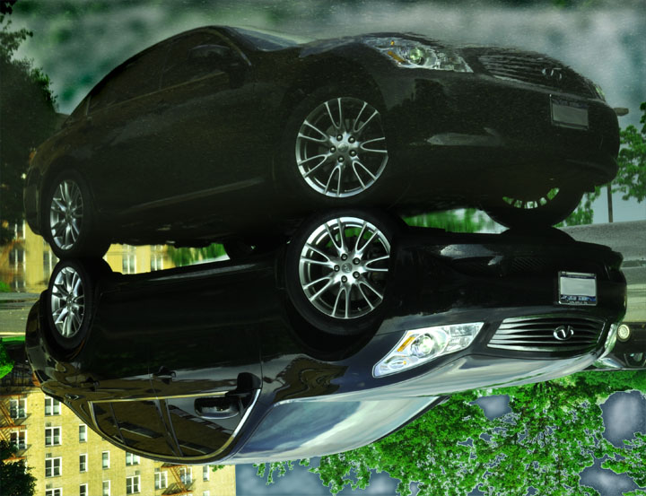
Don't know what has happened in the bottom right corner. presenting the reflection as the top part of the photo is a different and effective choice, but the other processing artifacts in the image, especially also in the top half are a big distraction from the overall effect
Not sure what's going on here, the lower half seems sharper and clearer than the upper half. It seems like you've taken a shot with a reflection then flipped it, but something still struck me as weird about it so I copied it out and flipped it and the original looks a lot better!
Just one thing though, whatever you've done to the the trees in the background has made them look really odd. My guess is that you've tried to improve the look of the sky, but it's ended up making the whole background look superimposed and false.
When I first looked at this, I thought, "Eek, watercolor PS effects!" Then I realized that the "effect" is just the texture of the pavement under the puddle in an inverted reflection shot. I think this idea can work well in some cases, but I can't really see any benefit of doing it in an auto ad like this, except to distract from the crazy things you did with the sky : )
Personally, it would have worked better for me if it wasn't flipped upside down, and left right side up. For me the distortion of the reflection (top right of the image) is distracting and "plays visual tricks" with the viewer, where my first reaction is "what's wrong with this picture" vs left right side up, my first reaction would be "wow, he/she has an almost perfect reflection." But that's just my humble opinion. Good luck.






 Add photograph to your favorites
 Add photographer to your favorites


 Photographer found comment helpful.


