| Author | Thread |
Comments Made During the Challenge  |
|
|
05/12/2009 10:28:30 PM |
|
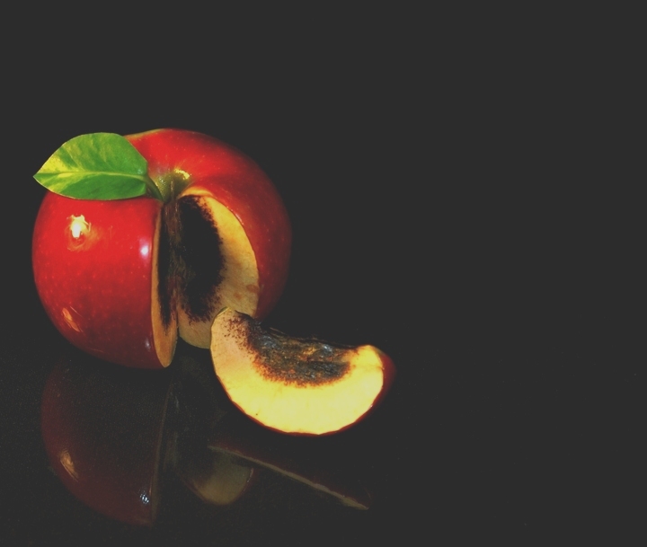
Nice shot but, to me, the brightness appears to be set way too high giving the shot and all over washed out effect. |
|
 Photographer found comment helpful. Photographer found comment helpful. |
|
|
05/11/2009 02:30:22 PM |
|
This isn't a bad idea and the comp is ok, but it's just overexposed...was that intentional? |
|
| Photographer found comment helpful. |
|
|
05/10/2009 04:51:34 PM |
|
Nice picture! It might look a little better if the black levels were a bit deeper, just my opinion. |
|
| Photographer found comment helpful. |
|
|
05/09/2009 10:39:43 AM |
|
Hm, I like the idea really much, but in my opinion it wouldve been better without this grey layer everywhere... |
|
| Photographer found comment helpful. |
|
|
05/08/2009 01:00:20 PM |
|
The blacks aren't black enough for me |
|
| Photographer found comment helpful. |
|
|
05/07/2009 11:42:57 PM |
|
On the technical side, I think something happened in your PP with the contrast. The black of the background looks "muddied." On the positive side, you subject/concept is good. |
|
| Photographer found comment helpful. |
|
|
05/07/2009 10:42:14 PM |
|
As a result of the flat gray cast to the image that masks a slight over exposure of the subject, this isn't as impressive as it could be. |
|
| Photographer found comment helpful. |
|
|
05/07/2009 08:39:28 PM |
|
like your idea. would like to see a blacker black. |
|
| Photographer found comment helpful. |
|
|
05/07/2009 05:13:45 AM |
|
Good idea but the white filter on top is kind of disturbing. the apple seems burned from the inside and not rotten.. but that might not have been your meaning either. great ide though! |
|
| Photographer found comment helpful. |
|
|
05/06/2009 08:47:35 PM |
Unlucky........glad you cut that and didn't bite into it arn't you.
I like the idea, but a few things ont eh execution. The flash lights on the apple are a major distraction. They emphasise that the lighting is uneven and quite harsh. The leaf there looks fake, like it has been placed there, and wasn't there originally. I would have cropped off the top area of the apple. At the moment, the dead space above does little for the image, and causes the apple to be centred. I feel the upper dead space detracts from the effect you were after with the negative sapce to the right. Cropping the topmakes this other negative space more effective.
Unfortunately, your refelctions are not distinct enough to really become a strong feature either. |
|
| Photographer found comment helpful. |
|
|
05/06/2009 06:05:06 AM |
|
Ouch... This is a fine image that would have scored pretty well, but your calibration is way off. Your background is dark grey, and the image as a whole has a grey haze. |
|
| Photographer found comment helpful. |
|
|
05/06/2009 05:58:23 AM |
|
the levels appear to have been adjusted and the blacks appear gone - as if the background was brightened artificially leaving a 'grey' look instead of black |
|
| Photographer found comment helpful. |
|
|
05/06/2009 01:34:57 AM |
|
i wish the ambient color was more black and less gray i feel like it reallly takes alot away from the efficacy of the photo |
|
| Photographer found comment helpful. |
|
|
05/06/2009 12:31:51 AM |
|
Image looks hazy; the apparent blacks aren't dark enough. Unique idea. The reflection is interesting. |
|
| Photographer found comment helpful. |
Home -
Challenges -
Community -
League -
Photos -
Cameras -
Lenses -
Learn -
Help -
Terms of Use -
Privacy -
Top ^
DPChallenge, and website content and design, Copyright © 2001-2026 Challenging Technologies, LLC.
All digital photo copyrights belong to the photographers and may not be used without permission.
Current Server Time: 06/29/2026 07:44:14 PM EDT.