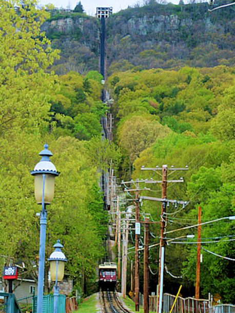
Well, it's not very sharp, that's the first thing I notice about it. The lamp post in the front is fighting for my attention with the train and the wires. It's a cool location with potential, but I don't think this is doing it justice.
If image were a little crisper and a lot sharper, it could very well be a great advertisement. Unfortunately, a great idea and composition is flawed by it's unclear nature. The image also appears flat and not particularly interesting in terms of color. It might have helped to use a little better aperature control - it's almost as if this is a straight auto shot which is never a good idea in this kind of light. A good idea just short of being a great image.
That's quite the incline!! Great subject for the challenge. Technicals could be a bit stronger (kinda soft on focus, and if there was a way to compose to minimize that first light ficture, I think it would put more emphasis on the train.)





 Add photograph to your favorites
 Add photographer to your favorites


 Photographer found comment helpful.


