| Author | Thread |
|
|
04/22/2009 08:18:59 AM |
First of all, thanks to all the commenters!
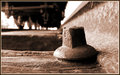
ProdigalMedic: this was post process sepia. This train is a museum now, and it has a horrible pink sticker band keeping doors from being opened, that's why I had to either use black & white or sepia, to hide it as much as possible.
smudgeSMJ: I tried it in B&W too, but I found it too "busy". It was hard to tell what it was. Sepia gave it some more contrast and depth.
Teafran: thank you so very much for your comments. They are always very nice and constructive. I really appreciate the time you take to give your point of view! |
|
Comments Made During the Challenge  |
|
|
04/19/2009 04:49:16 PM |
|
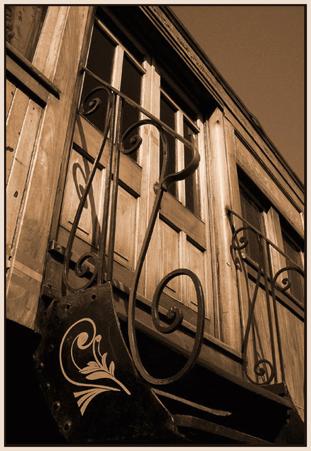
Good title, suits the lead in from the steps. Lovely sepia Tone |
|
 Photographer found comment helpful. Photographer found comment helpful. |
|
|
04/18/2009 10:33:13 AM |
|
| Photographer found comment helpful. |
|
|
04/17/2009 09:00:57 PM |
|
A compelling image, the gentle tone shift and color cast is a brilliant choice to match the detailed subject matter. The gentle shift in tone from the subject to the sky is excellant and the slightly different angle is unique and very effective. This is a ribbon winner and possibly a blue ribbon - an extremely effective image. Well done. |
|
| Photographer found comment helpful. |
|
|
04/17/2009 01:41:18 PM |
|
Nice use of a strong sepia. I used to not care for sepia treatments, but then I recently found that I do like them when they are a bit on the strong side. |
|
| Photographer found comment helpful. |
|
|
04/16/2009 09:13:24 AM |
|
This is different. I don't care for the color choice here, I think it would be better imho in black and white, but that's a minor detail. |
|
| Photographer found comment helpful. |
|
|
04/15/2009 06:53:35 AM |
|
Great angle and contrast! Was the sepia shot in camera? or post process? |
|
| Photographer found comment helpful. |
Home -
Challenges -
Community -
League -
Photos -
Cameras -
Lenses -
Learn -
Help -
Terms of Use -
Privacy -
Top ^
DPChallenge, and website content and design, Copyright © 2001-2026 Challenging Technologies, LLC.
All digital photo copyrights belong to the photographers and may not be used without permission.
Current Server Time: 06/29/2026 11:04:42 PM EDT.