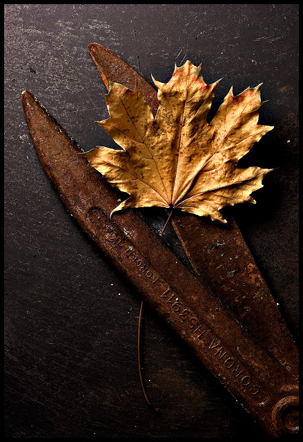
This shot looked a lot different on my work LCD, yellow of the leaf looked out of wack and as one comment mentioned it was too dark on the bottom. Tones look great on my home CRT, which I use for editing. So I wouldn't change a thing, other than cloning out some of the white specks which I missed cleaning up.
The concept was, with spring coming up we get our old tools out from last Summer and find some surprises. Which perhaps should've been Fall with the leaf in it. But anyways, I do like how this came out :)
Statistics
Place: 41 out of 334 Avg (all users): 6.0056 Avg (commenters): 7.5556 Avg (participants): 5.8022 Avg (non-participants): 6.2184 Views since voting: 1073 Views during voting: 251 Votes: 178 Comments: 13 Favorites: 3 (view)
I think the light falls off a little too much toward the bottom of the image. It isn't so much that it loses detail but maybe adding a diffused fill light from the bottom would bring out more of the tables texture too. the exposure on the leaf is very good and overall this is interesting to look at. Well done.
An artistic success with some minor technical flaws in what appear to be hot pixels which negatively impact the image. The contrast between smooth, nearly smooth and highly figured is a brilliant idea. A near miss for top ten honors and should place well in the top ten percent of the challenge.





 Add photograph to your favorites
 Add photographer to your favorites

 Photographer found comment helpful.


