| Author | Thread |
Comments Made During the Challenge  |
|
|
03/17/2009 03:00:19 PM |
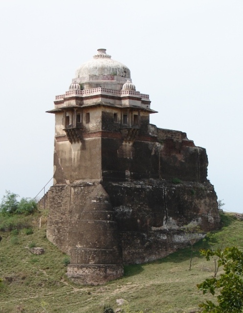
sorry this looks just like the snapshot of some fort... its shady without contrast... just three :(
good luck though and take it easy ;D
brano |
|
|
|
03/17/2009 02:07:17 PM |
|
Wow, I've never seen anything like that before, it's really neat and grand. |
|
|
|
03/17/2009 12:00:17 PM |
|
Nice capture of this interesting looking structure. Sky is a bit bland. A polarizing filter might have helped. |
|
|
|
03/16/2009 01:59:54 PM |
|
Good placement of the subject in the frame. |
|
|
|
03/16/2009 01:15:46 PM |
|
Good shot. Unique type building. |
|
|
|
03/16/2009 01:09:49 PM |
|
colors are a bit flat, missing some detalis |
|
|
|
03/16/2009 10:43:54 AM |
|
Interesting architecture. Nice framing on it. Some HDR action would really bring out the detail here. |
|
|
|
03/16/2009 04:12:49 AM |
|
|
|
03/16/2009 02:53:50 AM |
|
Well captured and presented. |
|
|
|
03/15/2009 10:50:29 PM |
|
The washed out sky does not help this image. |
|
|
|
03/15/2009 09:33:01 PM |
|
Nice clean photo, great title. |
|
|
|
03/15/2009 03:42:42 PM |
|
Nice shot, good textures and detail, |
|
|
|
03/15/2009 09:56:53 AM |
|
|
|
03/14/2009 11:35:36 PM |
|
An interesting building. Looks overexposed and washed out, though. |
|
|
|
03/14/2009 11:04:19 PM |
|
|
|
03/14/2009 10:31:37 PM |
|
An interesting building. Top almost gets lost in the sky. |
|
|
|
03/14/2009 02:27:21 PM |
|
What an interesting place. |
|
|
|
03/14/2009 01:00:44 PM |
|
|
|
03/14/2009 09:44:01 AM |
|
What a fascinating structure. |
|
|
|
03/14/2009 04:27:18 AM |
|
Lovely old fort. Looks like it has know better times, but it still is very impressive. |
|
|
|
03/13/2009 07:11:13 PM |
|
The top of the building seems to be overexposed. |
|
|
|
03/13/2009 07:11:10 PM |
|
maybe bumping up the contrast would help add some depth. |
|
|
|
03/13/2009 03:48:45 PM |
|
Very stark. Nice graduation of dark to light. An interesting scene! |
|
|
|
03/13/2009 10:30:44 AM |
|
too bad the light was so flat |
|
|
|
03/12/2009 04:42:10 PM |
|
Nice photo. Seems a little washed out to me. Maybe a little more saturation would help. Nice photo and well taken all the same. |
|
 Photographer found comment helpful. Photographer found comment helpful. |
|
|
03/12/2009 01:16:39 AM |
|
tough lighting... sky's a little bright IMO |
|
| Photographer found comment helpful. |
|
|
03/11/2009 08:19:32 PM |
|
Good composition the balance of light and shadows on the fort. |
|
| Photographer found comment helpful. |
|
|
03/11/2009 07:02:22 PM |
|
this is a really great capture...but it is flat in tones/color...did you do curves/levels? |
|
| Photographer found comment helpful. |
|
|
03/11/2009 06:53:34 PM |
|
Looks like an interesting place to visit, let alone photograph. |
|
|
|
03/11/2009 06:38:23 PM |
|
Interesting building. Would be nice if possible to return under better lighting conditions. |
|
| Photographer found comment helpful. |
|
|
03/11/2009 06:11:32 PM |
|
This is a rather standard shot. The colors could pop out a bit more and the top of the building is lost in the starkness of the sky. |
|
| Photographer found comment helpful. |
|
|
03/11/2009 05:53:02 PM |
|
interesting looking building |
|
| Photographer found comment helpful. |
|
|
03/11/2009 05:03:52 PM |
|
good composition, but over all it's a little over exposed and need a bit more contrast. |
|
| Photographer found comment helpful. |
|
|
03/11/2009 04:59:37 PM |
|
| Photographer found comment helpful. |
|
|
03/11/2009 08:50:46 AM |
|
Nice subject but a little bland for me in colors. I think you needed more contrast. |
|
| Photographer found comment helpful. |
|
|
03/11/2009 04:47:33 AM |
|
white sky is distracting and pity the top blends into it |
|
| Photographer found comment helpful. |
|
|
03/11/2009 02:37:55 AM |
|
colors are flat.. might look better in b&w or beef up the saturation. |
|
| Photographer found comment helpful. |
Home -
Challenges -
Community -
League -
Photos -
Cameras -
Lenses -
Learn -
Help -
Terms of Use -
Privacy -
Top ^
DPChallenge, and website content and design, Copyright © 2001-2026 Challenging Technologies, LLC.
All digital photo copyrights belong to the photographers and may not be used without permission.
Current Server Time: 06/29/2026 02:46:46 PM EDT.