| Author | Thread |
|
|
03/09/2009 03:48:45 AM |
|
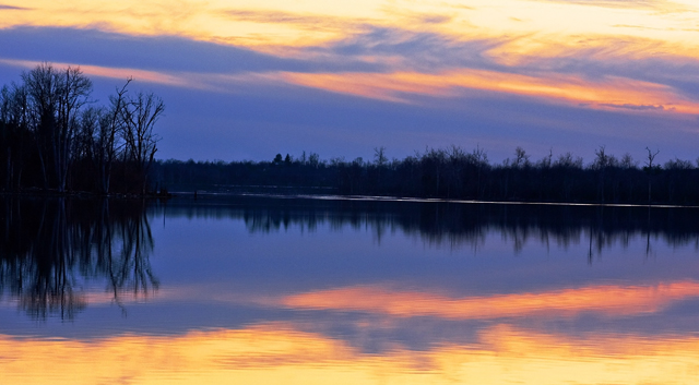
I agree with the others, tilted horizon and it also looks a tad bit shakey...were you using a tripod or was the dock moving? The colors are very nice and it has good symmetry, but it leaves me wanting more, especially on the top and bottom. |
|
 Photographer found comment helpful. Photographer found comment helpful. |
|
|
03/09/2009 03:14:10 AM |
I'll differ a bit on the "don't use a centered horizon" part. It CAN work but you have to have a reason to use it - symmetry, point of interest, etc. For a simple landscape/waterscape shot, pick what you want to emphasize (water/ground or sky) and compose and crop accordingly. There's that lovely "rule of thirds" for composition that time has shown is generally pleasing to the eye.
Also, your horizon may in fact not be tilted at all, but due to the natural curbature of the body of water. The wake in the distance catching the light emphasizes that, and the overall EFFECT (but perhaps not reality) is a tilted horizon. Again, it can work but only if there's a distinct reason for it. Here the "eye" wants it to be nice and level - less disconcerting that way.
Finally, there are voters that have been at DPC for many years who tire of sunsets with no other point that a picture of a sunset. Sounds harsh, but it is one possible reason for a lower than you expected score. |
|
| Photographer found comment helpful. |
|
|
03/08/2009 11:55:16 PM |
I really don't know what to tell you on this one. Yo_Spiff is correct about the tilted horizon, but I'm really not a landscape photographer, so I have very little to add.
Just from what I've read though, there is one main thing here you want to avoid. A centered horizon. The better landscape shots have the horizon less centered in the shot. There is either more ground, or more sky, and there's always some kind of focal point. Something to look at, which is offered in a way which leads to viewer to expand their vision to the rest of the photo.
Look around in the ribbon winners gallery for landscapes that win ribbons, and compare your shot with those. I'm not saying that you'll need to suddenly find amazing seascapes and such all at once, but try and look at what they are doing compared to what you are doing and maybe see if you can start applying some of the basics to your future shots.
As for my thoughts on why this scored so low, for my money it's just a plain, flat, boring photo when compared to its competition in a free study. It has some nice play in the sky, but there really isn't much there to grab someone making a fly-by on the vote. It's dark, and there is no point of interest compared to the shots that do better on this website.
|
|
| Photographer found comment helpful. |
|
|
03/08/2009 11:34:19 PM |
|
The scene is pleasant and the tones are nice and smooth. I think the biggest thing that hurt you in voting was the tilted horizon that was also very centered top to bottom. The composition may not have been very eye-leading. |
|
| Photographer found comment helpful. |
Comments Made During the Challenge  |
|
|
03/06/2009 11:58:36 PM |
|
| Photographer found comment helpful. |
|
|
03/05/2009 09:46:18 PM |
Interesting color here. Not sure it works for me, but what I do like...
Is the composition and how you chose natures mirrors. Focus is soft and creates some mystery. 6 |
|
| Photographer found comment helpful. |
|
|
03/05/2009 08:58:45 PM |
|
Great color composition. Very symmetrical. |
|
| Photographer found comment helpful. |
|
|
03/04/2009 11:09:18 AM |
|
| Photographer found comment helpful. |
Home -
Challenges -
Community -
League -
Photos -
Cameras -
Lenses -
Learn -
Help -
Terms of Use -
Privacy -
Top ^
DPChallenge, and website content and design, Copyright © 2001-2026 Challenging Technologies, LLC.
All digital photo copyrights belong to the photographers and may not be used without permission.
Current Server Time: 06/29/2026 08:26:09 AM EDT.