I think the blues you captured and their relationship to the sky is just wonderful - the contrast with the rust really helps to bring it out. I wonder if a more off-center composition with the center column would help provide just a little more visual interest. I think it was a worthy subject for this challenge.
A little too far away from the subject, maybe just pick one or two and change the angle slightly. It is also on a skew slightly. fits the challenge well.
Nice balance between the design elements. If it were possible to take this from a lower point of view it would have obscured the background greenery and houses which are somewhat distracting. Also a touch underexposed on the bottom which removes some detail. That's not all bad if it was your intent to do so in order to emphasize the brighter graphiti elements.
Seems to me it would have been more effective if you would've used a tighter crop. The subject would be more emphasized, and the background would be less distracting. Just my opinion.




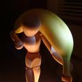


 Add photograph to your favorites
 Add photographer to your favorites


 Photographer found comment helpful.


