| Author | Thread |
Comments Made During the Challenge  |
|
|
02/21/2009 10:12:08 AM |
|
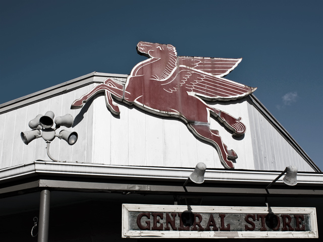
like this shot...to bad the shadows of the lights are on the General Store sign...seems like level/curves would help with the wash out of the building, might have helped with the red in the photo too... |
|
 Photographer found comment helpful. Photographer found comment helpful. |
|
|
02/20/2009 12:00:49 PM |
|
|
|
02/19/2009 03:14:13 PM |
|
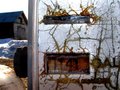
Missed the gas station theme. |
|
|
|
02/19/2009 10:50:01 AM |
|
I wish the red were more saturated in this, that would make it pop more for me... Something is lacking here but I can't put my finger on it. I think that the composition is just a little too dull perhaps? |
|
|
|
02/18/2009 01:14:01 PM |
|
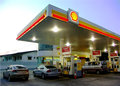
Nostalgia! Love this one. |
|
Home -
Challenges -
Community -
League -
Photos -
Cameras -
Lenses -
Learn -
Help -
Terms of Use -
Privacy -
Top ^
DPChallenge, and website content and design, Copyright © 2001-2026 Challenging Technologies, LLC.
All digital photo copyrights belong to the photographers and may not be used without permission.
Current Server Time: 06/28/2026 03:13:56 AM EDT.