| Author | Thread |
|
|
02/25/2009 02:48:14 AM |
|
I gave this a nine in voting, it is a great natural diptych. It seems like it could have been an ad. I really like liked it, sorry other voters didn't agree. |
|
 Photographer found comment helpful. Photographer found comment helpful. |
Comments Made During the Challenge  |
|
|
02/24/2009 03:07:53 PM |
|
I like the idea with the column, though the rest is a bit too busy for me. Still a plus point for originality. |
|
| Photographer found comment helpful. |
|
|
02/21/2009 10:28:31 AM |
|
good focus...good exposure |
|
| Photographer found comment helpful. |
|
|
02/20/2009 12:21:29 PM |
|
| Photographer found comment helpful. |
|
|
02/19/2009 03:15:35 PM |
|
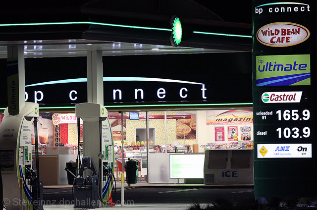
Would like to see it without the gas price sign on the right. |
|
| Photographer found comment helpful. |
|
|
02/19/2009 08:38:48 AM |
|
Good clarity, nothing is too blown out. I'm not sure what is the central focus here though. Also, I must admit that it bugs my brain a little to have the "o" in "connect" cut out so completely. |
|
| Photographer found comment helpful. |
|
|
02/18/2009 04:59:14 PM |
|
| Photographer found comment helpful. |
|
|
02/18/2009 01:05:28 PM |
|
| Photographer found comment helpful. |
|
|
02/18/2009 02:06:27 AM |
|
| Photographer found comment helpful. |
Home -
Challenges -
Community -
League -
Photos -
Cameras -
Lenses -
Learn -
Help -
Terms of Use -
Privacy -
Top ^
DPChallenge, and website content and design, Copyright © 2001-2026 Challenging Technologies, LLC.
All digital photo copyrights belong to the photographers and may not be used without permission.
Current Server Time: 07/16/2026 12:59:35 AM EDT.