| Author | Thread |
Comments Made During the Challenge  |
|
|
05/16/2004 05:40:33 AM |
|
excellent display..well done |
|
 Photographer found comment helpful. Photographer found comment helpful. |
|
|
05/15/2004 09:08:54 PM |
|
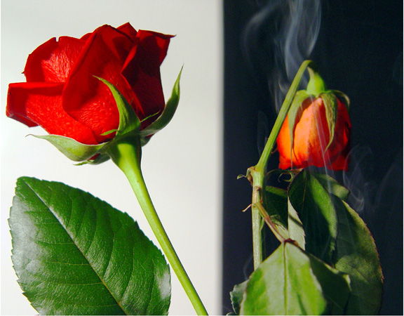
The smoke from the right rose is a nice touch. Good exposure and setup. Seems like the white background should be a bit whiter. |
|
| Photographer found comment helpful. |
|
|
05/15/2004 05:37:46 PM |
Interesting shot..
there's some dirt or grains on the left rose though, a little annoying |
|
| Photographer found comment helpful. |
|
|
05/15/2004 04:59:45 PM |
|
lighting on left pretty harsh. use a piece of paper towel over the light source in order to diffuse the light and give it a softer effect. i also would have chosen a different background. |
|
| Photographer found comment helpful. |
|
|
05/15/2004 03:39:57 AM |
|
| Photographer found comment helpful. |
|
|
05/14/2004 03:54:14 PM |
|
| Photographer found comment helpful. |
|
|
05/14/2004 10:18:18 AM |
|
Very interesting composition. A bit overexposed on the left leaf. |
|
| Photographer found comment helpful. |
|
|
05/13/2004 10:32:16 PM |
|
White background for both would be less distracting from a good idea |
|
| Photographer found comment helpful. |
|
|
05/13/2004 02:56:31 PM |
|
This almost achieves a mirrored effect. I wish it had. A 5. |
|
| Photographer found comment helpful. |
|
|
05/13/2004 12:41:35 PM |
|
Cool effect... I'd like to see how you did it. |
|
| Photographer found comment helpful. |
|
|
05/12/2004 10:41:47 PM |
|
| Photographer found comment helpful. |
|
|
05/12/2004 01:11:36 PM |
|
I'd be happier if part of at least one of the roses overlapped the black/white transition so that it was clear both were in the same original photo. I'd also be happier without the blue smoke. |
|
| Photographer found comment helpful. |
|
|
05/12/2004 10:20:54 AM |
|
Could have had sharper contrast between backgrounds, black background could be true black |
|
| Photographer found comment helpful. |
|
|
05/12/2004 03:58:22 AM |
|
the rose looks very plastic, but very crisp and clean colors nonetheless... i love the smoke on the second half |
|
| Photographer found comment helpful. |
|
|
05/12/2004 01:03:14 AM |
|
I was a bit "blah" about how the white was larger than the black, and the white side's rose much sharper, but maybe you intended it that way, I don't know. Was the title supposed to be "Life & Death" perhaps? I didn't take that in to account for scoring, by the way, just curious. :) |
|
| Photographer found comment helpful. |
Home -
Challenges -
Community -
League -
Photos -
Cameras -
Lenses -
Learn -
Help -
Terms of Use -
Privacy -
Top ^
DPChallenge, and website content and design, Copyright © 2001-2026 Challenging Technologies, LLC.
All digital photo copyrights belong to the photographers and may not be used without permission.
Current Server Time: 06/30/2026 06:38:10 PM EDT.