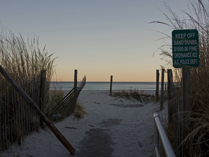
This is Kari Ann, greetings from the Critique Club:
composition: A bit offputting with the horizon being dead center. maybe more of the path could have been included to tie in with the title better.
color: I love the neutral tones, very pleasing and just perfect for the scene
contrast: contrast could have been too soft for some, but I think it fits the mood quite well. a very peaceful and serene spot
focus: very nice and even across the entire scene presented
depth of field: I like the use of a wide aperture, it gives the photo a soft yet sharp look.
lighting: I would suggest the fill light as well, or a bump in shadows in photoshop. perhaps it would have given this photo more kick. but a very nice sunset in the background
other: All in all, i think this was a nice image. But nothing popped off the image or made me go, "WOA!". i think that's why most voters gave this an average or lower score. But, for technical processes props, you did very well in my eye. just try different compositions when viewing a scene, and give it a whirl. Hope this helped you some, if you have any more questions, feel free to PM me. keep shooting!
-Kari Ann |