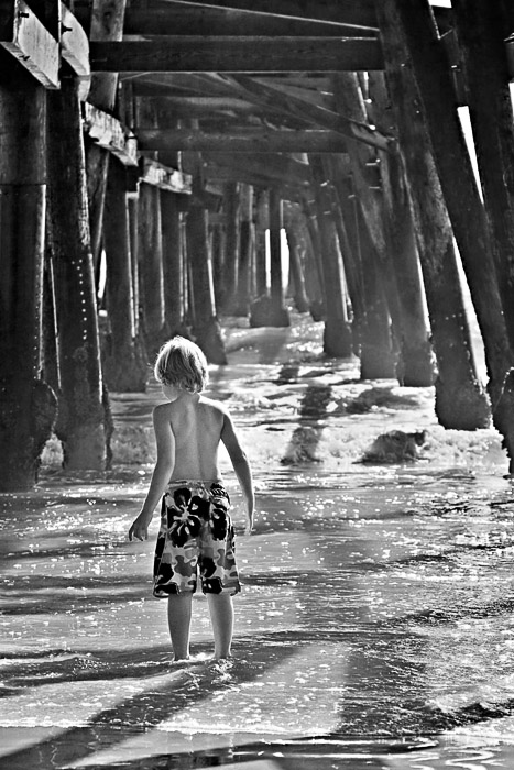
I like this one the best for a few reasons:
1) The sunbeam is clearly exposing the boy, which makes this intersting. Perhaps a guardian light of some sort.
2) Since the tones of the pier are closer together, its much easier to follow and adds a strong sense of depth to the photo. In the color one, the different colors just add too much chaos to what is a natural direction of the pier and the pier becomes lost with the metal tint.
3) Finally, the details of the water are more clear. This gives a nice contrast to chaos below, order above. |







 Add photograph to your favorites
 Add photographer to your favorites

 Photographer found comment helpful.


