| Author | Thread |
Comments Made During the Challenge  |
|
|
12/16/2008 11:17:47 PM |
|
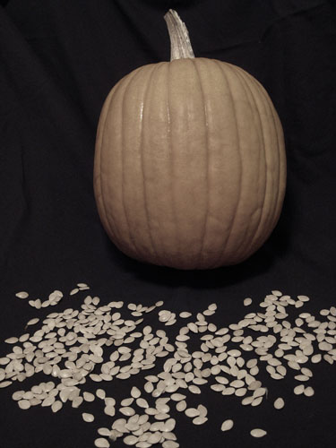
Right idea. What happened to the color? |
|
 Photographer found comment helpful. Photographer found comment helpful. |
|
|
12/16/2008 08:49:03 AM |
|
Good idea, would have liked the shot to be stronger in colour though. |
|
| Photographer found comment helpful. |
|
|
12/15/2008 09:26:41 PM |
|
if u use more colors it will be better |
|
| Photographer found comment helpful. |
|
|
12/15/2008 04:39:03 AM |
|
I feel that this shot could use with a bit more colour. Perhaps saturated more to really bring out the orange in the pumpkin. |
|
| Photographer found comment helpful. |
|
|
12/13/2008 08:27:45 PM |
|
Feels a little flat, missing contrast and colour maybe. |
|
| Photographer found comment helpful. |
|
|
12/13/2008 01:51:39 PM |
|
I would have liked to see this in full colour. |
|
| Photographer found comment helpful. |
|
|
12/13/2008 10:13:35 AM |
|
nice picture, would have been better is pumkin was a bit more orange 6 |
|
| Photographer found comment helpful. |
|
|
12/12/2008 09:59:08 PM |
|
Not terribly interesting. Colors are kind of dull; lighting's a bit harsh, flat. |
|
| Photographer found comment helpful. |
|
|
12/12/2008 11:05:45 AM |
That pumpkin looks like its floating there. Eerie.
Good idea, but the image feels rather flat. |
|
| Photographer found comment helpful. |
|
|
12/11/2008 10:10:00 PM |
|
thou I like your example...it lacks in color, kind of dull and flat in tone |
|
| Photographer found comment helpful. |
|
|
12/11/2008 09:09:38 AM |
The washed out colours don't really help this shot in my opinion. Pumpkins in particular have such wonderful colours it would be better to emphasize it rather than desaturate it.
Also, compositionally it's not strong, perhaps if the fruti was moved to the left or right of the image and the seeds all brought within the shot it would improve it. |
|
| Photographer found comment helpful. |
|
|
12/11/2008 01:16:01 AM |
|
| Photographer found comment helpful. |
|
|
12/10/2008 09:28:21 AM |
|
I think that more saturation would make this pop more, and I also find the visible folds in the background distracting, as well as the shadow around the bottom and side of the pumpkin. |
|
| Photographer found comment helpful. |
|
|
12/10/2008 09:19:03 AM |
|
composition is decent. I'd like more contrast and sharpness. |
|
| Photographer found comment helpful. |
|
|
12/10/2008 08:04:33 AM |
|
I find the colours quite drab, and perhaps you could have arranged the subject matter in a more interesting way. |
|
| Photographer found comment helpful. |
|
|
12/10/2008 12:37:52 AM |
|
a little drab but a great idea I get knocked for shadow and not being in focus but I like it |
|
| Photographer found comment helpful. |
Home -
Challenges -
Community -
League -
Photos -
Cameras -
Lenses -
Learn -
Help -
Terms of Use -
Privacy -
Top ^
DPChallenge, and website content and design, Copyright © 2001-2026 Challenging Technologies, LLC.
All digital photo copyrights belong to the photographers and may not be used without permission.
Current Server Time: 06/30/2026 12:15:56 AM EDT.