| Author | Thread |
|
|
07/23/2010 07:12:22 PM |
|
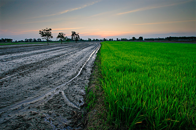
This is great. Two distinct areas. |
|
Comments Made During the Challenge  |
|
|
12/08/2008 11:27:29 PM |
|
My first reaction was oooh pretty, then the grass upon inspection looks supersaturated, I think you pushed it a tad bit too far because the details of the blades is lost |
|
 Photographer found comment helpful. Photographer found comment helpful. |
|
|
12/08/2008 11:37:21 AM |
|
This would have been great for the "Before/After" Challenge. |
|
| Photographer found comment helpful. |
|
|
12/08/2008 10:38:34 AM |
|
This would be a good one for the Before and After challenge this week! Other than that, I really like the contrast between the two sides of the picture, but maybe the green is too saturated... Good job! |
|
| Photographer found comment helpful. |
|
|
12/04/2008 01:05:02 PM |
|
Cool idea for a pic, great colors, I dig the composition. |
|
| Photographer found comment helpful. |
|
|
12/03/2008 06:09:17 PM |
|
This would make a great Before & After shot for this week's challenge! |
|
| Photographer found comment helpful. |
|
|
12/03/2008 05:00:26 PM |
|
| Photographer found comment helpful. |
|
|
12/03/2008 02:59:32 PM |
|
The vignetting is a bit distracting in this otherwise very nice photograph. |
|
| Photographer found comment helpful. |
|
|
12/03/2008 12:16:37 PM |
|
Really powerful! Love this |
|
| Photographer found comment helpful. |
|
|
12/03/2008 01:17:06 AM |
|
too much color sat, the mud looks kinda blue! |
|
Home -
Challenges -
Community -
League -
Photos -
Cameras -
Lenses -
Learn -
Help -
Terms of Use -
Privacy -
Top ^
DPChallenge, and website content and design, Copyright © 2001-2026 Challenging Technologies, LLC.
All digital photo copyrights belong to the photographers and may not be used without permission.
Current Server Time: 06/28/2026 07:12:45 AM EDT.