| Author | Thread |
Comments Made During the Challenge  |
|
|
05/11/2004 06:52:25 PM |
|
|
|
05/11/2004 12:02:12 PM |
|
Nice depth of field, but lacking in a strong point of interest for me. |
|
|
|
05/11/2004 09:31:29 AM |
|
|
|
05/10/2004 04:35:59 PM |
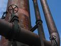
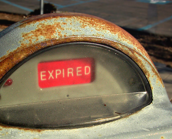
The setting is a little cluttered. This would have been a good shot to have put a screen up behind. I would also liked to have seen more to the left.
A 4. |
|
|
|
05/09/2004 09:45:23 PM |
Composition: Subject Placement, Cropping, Background 6
Technical: Focus, Exposure, Lighting, Processing 6
Appeal: Is it Interesting, Motivating, Etc. 5
How well does it meet the challenge: 7
Total Averaged Rating(Rounded) 6
|
|
|
|
05/09/2004 04:17:28 PM |
|
The background is rather distracting. Perhaps a tighter crop might do the trick or bring the camera in closer. |
|
|
|
05/09/2004 03:40:30 PM |
|
excellent, better if the glass wasnt extremelyblury though |
|
|
|
05/09/2004 01:06:04 PM |
|
|
|
05/07/2004 11:38:05 AM |
Composition: Subject Placement, Cropping, Background 7
Technical: Focus, Exposure, Lighting, Processing 9
Appeal: Is it Interesting, Motivating, Etc.? 6
How well does it meet the challenge: 7
Total Averaged Rating 7 Dick
|
|
|
|
05/07/2004 09:45:56 AM |
|
really apt like it a lot, shame glass was a bit aged, would have looked nice if clearer..not your fault of course |
|
|
|
05/06/2004 06:43:58 PM |
|
Nice choice of subject. It's more than just a "gratuitous rusted object" |
|
|
|
05/06/2004 06:33:36 PM |
|
to me the red is to out standing |
|
|
|
05/06/2004 12:50:02 PM |
|
I like the symbolism/irony. Don't care much for the background elements, maybe a slightly different perspective that would distort or hide the background would make it more appealing. |
|
|
|
05/06/2004 12:48:37 PM |
|
very nice shot. very ironic! -9 |
|
|
|
05/06/2004 04:48:21 AM |
|
|
|
05/05/2004 07:12:53 PM |
|
Different title probably would have worked here. Good shot. |
|
|
|
05/05/2004 11:10:47 AM |
|
lol.....love it. The crop could of been improved on the lower right. Fun shot. |
|
Home -
Challenges -
Community -
League -
Photos -
Cameras -
Lenses -
Learn -
Help -
Terms of Use -
Privacy -
Top ^
DPChallenge, and website content and design, Copyright © 2001-2026 Challenging Technologies, LLC.
All digital photo copyrights belong to the photographers and may not be used without permission.
Current Server Time: 07/02/2026 06:35:12 PM EDT.