| Author | Thread |
Comments Made During the Challenge  |
|
|
12/07/2008 04:52:43 PM |
|
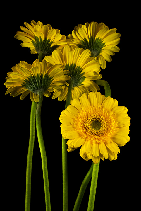
Love the yellow in this shot. Title fits! |
|
 Photographer found comment helpful. Photographer found comment helpful. |
|
|
12/07/2008 11:14:29 AM |
|
| Photographer found comment helpful. |
|
|
12/06/2008 09:03:47 PM |
|
Banmornish. I love gerberas. 6 |
|
| Photographer found comment helpful. |
|
|
12/06/2008 12:14:39 PM |
|
nice arrangement and lighting |
|
| Photographer found comment helpful. |
|
|
12/06/2008 10:32:38 AM |
The contrast of the bright yellow against the black is striking.
Guessing this is  banmorn's work. :) banmorn's work. :) |
|
| Photographer found comment helpful. |
|
|
12/05/2008 07:42:06 PM |
|
I think the flowers facing the other way are a litle darker than the one facing tord you.But I love it.8 |
|
| Photographer found comment helpful. |
|
|
12/04/2008 11:02:21 AM |
|
Nice vibrant colors, good comp, 7. |
|
| Photographer found comment helpful. |
|
|
12/03/2008 11:04:51 AM |
The lighting seems to be a touch 'flat' for my taste. Perhaps having added another light either above (pointing straight down) or having it backlit would give it more 'pop' & separation from the background.
On the plus side, the concept & composition are most excellent :) |
|
| Photographer found comment helpful. |
|
|
12/02/2008 06:27:41 PM |
|
| Photographer found comment helpful. |
|
|
12/02/2008 10:57:27 AM |
|
Must be banmorn's photo! Perfect lighting as usual. |
|
| Photographer found comment helpful. |
|
|
12/02/2008 12:44:32 AM |
|
| Photographer found comment helpful. |
|
|
12/01/2008 04:34:44 AM |
|
overall a bit muddy-looking. wish there was more contrast of any kind (color/luminance/focus) between foreground and background |
|
| Photographer found comment helpful. |
Home -
Challenges -
Community -
League -
Photos -
Cameras -
Lenses -
Learn -
Help -
Terms of Use -
Privacy -
Top ^
DPChallenge, and website content and design, Copyright © 2001-2026 Challenging Technologies, LLC.
All digital photo copyrights belong to the photographers and may not be used without permission.
Current Server Time: 07/01/2026 11:11:03 PM EDT.