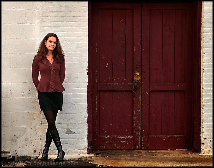
first photo shoot with a model (thanks Karen!). I really liked the vibe of this storefront, and was going for a contrast between the fashionable clothes and dingy, harsh setting.
I wanted to challenge myself for this entry. I purposefully didn't shoot a landscape, my forte. I hope this does OK...
PP - crop. layers for levels. noise ninja. soft light layer. cloned out dark circles under eyes, and small blue sign on door. hue/sat on blouse to match door (was a brighter red to start). color shift on left side of wall to match right side. dupe layer in multiply, then mask. cloned out small white paper on ground. USM on image except for face. resize, add border.
[Dec. 6th, 2008 02:38:09 PM]
over 300 votes, and just under 6. keeps getting close, only to drop again. I've gotten some great comments, so that makes me happy. Overall, I'm pretty pleased with how this is doing, especially in this challenge. I think I'll do more of these in the future
Statistics
Place: 120 out of 170 Avg (all users): 5.9357 Avg (commenters): 6.5000 Avg (participants): 5.8723 Avg (non-participants): 5.9597 Views since voting: 1100 Views during voting: 684 Votes: 342 Comments: 17 Favorites: 0
Excellent composition and scene layout Steve! Perhaps less noise ninja would have helped--surely ou don't need it at ISO 200 on your camera! There does seem to be texture missing, but maybe even without the noise ninja, maybe not as much as would enhance the photo (you have texture where the wall and door are degraded, but not the surface textures themselves.)
I don't know why my initial reaction was a 9 on this...Now that I'm commenting I really can't justify knocking this off from a 10. Perhaps it was the model's facial expression, but everything else is so perfect. Great portrait!
I like how the reds match well, but otherwise it's like two different pictures, the left and the right. It seems like too much negative space. Maybe if she was in front of the left door and cropped in close, as long as she didn't fade into the door? Nice detail and old vs new.
Nice, I like how she opposites the door with coordinating colors, nice natural pose, too. The lighting is good and even, great job technically. You must know what you're doing. :) 10.
Nice door. Your model looks a bit tight. The crossed leg pose is cute and coy, but she's a bit stiff on the upper half to pull it off. At least in my opinion. Processing is good and I like the composition. 6
Did you change the color of her blouse to match the door? I like the limited color palette, but the color of the blouse feels a bit fake. I like the composition.






 Add photograph to your favorites
 Add photographer to your favorites

 Photographer found comment helpful.


