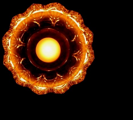
Thanks for the votes and comments. It turned out to be a very minimalistic picture, but I'm still very happy with it. Having it off-centered was a conscious decision; I kept thinking about an earlier entry ('Rough and the smooth' in the Out of place challenge), where many said it was too centered. I think Melismatica summed it up best here; a bit more ... something would've helped put it over the top.
Oh, and no '1's! Woohoo!
Cheers
Stu
It's very pretty. The cropping looks a little bit out, gigving the impression that it's tightly squeezed in the corner and doesn't feel that natural. i think it would look less out if either you a) zoomed out and pulled the thing towards the centre a bit (but increasing the quantity of black to the right and bottom, or b) zoomed in a bit and have the top and the left of the orange thing outside the boundary of the image. Actually, the item in question is so lovely, it could have filled the image - have you tried a macro shot of it, in the way you have it illuminated? Lighting BTW, is brilliant. Is it an ashtray with a light source underneath it? very nice. 7.






 Add photograph to your favorites
 Add photographer to your favorites


 Photographer found comment helpful.


