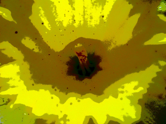
The controversy with your image seems to be two-fold. First, whether or not it is truly an abstract, and second, whether or not there is too much post-processing.
I, myself am not against the use of filters on digtal pictures, but in this case it feels like you forced a picture into abstraction, rather than taking an abstract photo. It's not a case of "does not meet challenge", more of a case using photoshop as a chainsaw, when sometimes it works best as sandpaper.
That being said, I'd like to give you a critique of the image as is, regardless of any challenge dictates.
I like the line of the image very much. I think the cropping was well done, as well as the focal point placement. I especially like that the small dots unify the picture and add interest. I think that the color has become a little muddy, especially around your focal point. So much of the pistal has become the same color as it's surroundings, that it looses it's strength.
I hope this is helpful! Please feel free to PM or email me if you have any questions, comments, or concerns.
I don't like this effect at all. It's abstract, but not really my cup of tea. you have reduced what was probably a nice flower shot to a 5 color mutation of something that could have looked nice. I realize this was for an abstract shot, but this just looks mutalated. the color isn't even wow. sorry it's just not my thing.
I don't normally react well to overtly editted shots. this however, rocks! Indeed, methinks it would make a terrific record sleeve. The shades of yellow are perfect, and i honestly can't think of a way i might've tried to improve. if i were ever skilled enough to get to a result such as this, i would leave well alone. Well done - 9.







 Add photograph to your favorites
 Add photographer to your favorites


 Photographer found comment helpful.


