| Author | Thread |
Comments Made During the Challenge  |
|
|
05/04/2004 01:02:29 PM |
|
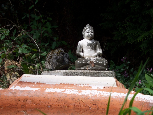
Interesting choice. I thought the "skinny" Budha was unknown outside China (and even there, for only a short period of a couple hundred years.) Given what you had to work with (a half painted statue), I think this composition is pretty strong. I might have cropped out the brick though. |
|
|
|
04/30/2004 12:58:32 PM |
|
Im not to sure what you were going for here. |
|
|
|
04/29/2004 04:43:32 PM |
|
this shot has a lot going on texturally-trees,grass,stones. I think this shot could be improved by getting closer to your main subject and revealing the wonderful details of the stone and the statue buddah. |
|
 Photographer found comment helpful. Photographer found comment helpful. |
|
|
04/28/2004 04:31:22 PM |
You could have spent a bit more time composing this photograph. The statement seems to be about the rock and the Buddah (I'm not sure what that statement is) so why take up so much of the frame with that expanse of distracting brick in the foreground. The blurred stems of grass isn't adding anything either. The darkness of the folliage does make a nice contrast with the Buddah but it would have been more striking if you had come in much tighter, placed the Buddah more to the left, and eliminated all that wasted space in the foreground and on either side of the arrangement.
Without the title it would have taken me a moment to notice the rock sitting there. It just looks kind of random and I don't get the point you are making. |
|
| Photographer found comment helpful. |
Home -
Challenges -
Community -
League -
Photos -
Cameras -
Lenses -
Learn -
Help -
Terms of Use -
Privacy -
Top ^
DPChallenge, and website content and design, Copyright © 2001-2026 Challenging Technologies, LLC.
All digital photo copyrights belong to the photographers and may not be used without permission.
Current Server Time: 06/29/2026 06:31:10 AM EDT.