| Author | Thread |
|
|
09/17/2008 12:17:49 AM |
|
Beautiful. I am stunned by this photograph. |
|
Comments Made During the Challenge  |
|
|
09/14/2008 05:07:21 PM |
|
|
|
09/12/2008 08:49:31 PM |
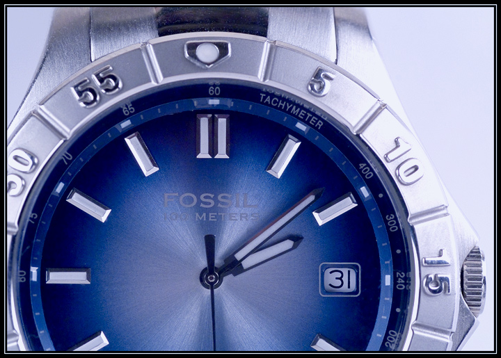
'Challenge: Product Shot (Sep. 1st 2008 - Sep. 7th 2008)'
Either you can see into the future or your watch needs an adjustment. At least it's pointing to near 10. I'll stick with that: 10 |
|
|
|
09/11/2008 10:01:26 PM |
|
good effort ... watches should always be displayed at 10:10 (don't ask me why) a black card on the right side would have helped define that edge more. |
|
|
|
09/11/2008 05:53:13 PM |
|
Very, very nice macro, I really like the blue tones. |
|
|
|
09/10/2008 11:51:43 PM |
wrong date for the chhallenge? :-)
another cropped watch, but this one shows more of the product. |
|
|
|
09/09/2008 07:09:28 PM |
|
Nice detail - great colours and lighting. |
|
|
|
09/09/2008 05:30:16 PM |
|
|
|
09/09/2008 05:13:24 PM |
Fit Challenge Criteria: 2/2
Contrast/Color: 2/2
Composition: 2/2
Photo Quality: 1/2
My Subjective Affinity: 2/2
What a great idea. The lighting is almost perfect. There are just a few hot spots that could have been removed. Also, I think a darker background would have looked better for this photo. Maybe a dark blue like the watch face. |
|
|
|
09/09/2008 09:48:12 AM |
|
Great color, nice brand closeup, good choice. |
|
|
|
09/09/2008 09:29:40 AM |
|
Brilliant sharpness and colour, the face looks so sleek. This shot is quite simply a joy on my eyes. Never thought I'd say that about photo of a watch, so well done. |
|
|
|
09/09/2008 01:21:14 AM |
|
the lighting on the sides seems a bit harsh, but I know how difficul it is with reflective objects and limited to basic processing I think you did good! |
|
|
|
09/08/2008 10:30:14 PM |
|
this is a great photo. hope it does well-8 |
|
|
|
09/08/2008 02:56:54 PM |
|
not a bad watch shot. The hands at 10:10 are used in watch and clock photography to set off the brand. That would have helped here and I would have also used some of the advanced editig techniques to bring out the Fossil name a bit more. |
|
|
|
09/08/2008 12:39:31 AM |
|
Home -
Challenges -
Community -
League -
Photos -
Cameras -
Lenses -
Learn -
Help -
Terms of Use -
Privacy -
Top ^
DPChallenge, and website content and design, Copyright © 2001-2026 Challenging Technologies, LLC.
All digital photo copyrights belong to the photographers and may not be used without permission.
Current Server Time: 06/28/2026 06:34:16 AM EDT.