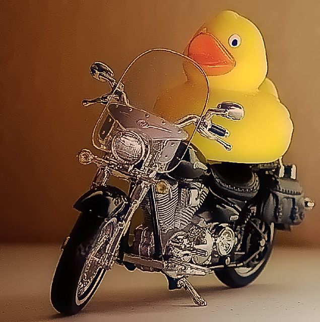
Love the idea and composition of elements in this shot. Lighting is really well done. The two main elements really fill the frame so it keeps the eye's attention were it needs to be. The only thing that really bothers me is that their seems to be an odd 'halo' that outlines the front portion of the bike - it is really noticable around the tire. The ducky also has something odd going on with it as that the edges appear to be too jaggy. A guess is that you might have over-sharped the image.
like the idea, but the picture looks like you took it from a distance then cropped him and the motorcycle...by doing this it makes it look like you saturated it to much or something...




 Add photograph to your favorites
 Add photographer to your favorites


 Photographer found comment helpful.


