| Author | Thread |
|
|
04/27/2004 01:50:06 AM |
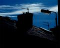
critique club**
very neat photo! i like the contrast. border is great. there is nothing i would change about this picture. i love the title too. good job!
Message edited by author 2004-04-27 01:52:11. |
|
Comments Made During the Challenge  |
|
|
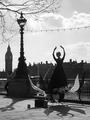
04/24/2004 11:31:08 AM |
|
The title throws me...the picture is very well done, though. Great composition. |
|
 Photographer found comment helpful. Photographer found comment helpful. |
|
|
04/22/2004 05:30:40 PM |
|
Like the idea that the subject is not silhoutted, and that the sky is perfectly blown out. Subject is positioned well, off center, but not formulatically in the tradition ROT positions. |
|
| Photographer found comment helpful. |
|
|
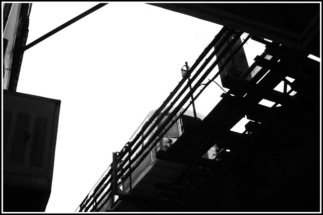
04/21/2004 11:58:05 AM |
|
| Photographer found comment helpful. |
|
|
04/19/2004 01:14:33 PM |
|
This is a great urban/industrial mood... very lending to a strong black and white image... excellent composition. |
|
| Photographer found comment helpful. |
|
|
04/19/2004 01:27:47 AM |
|
| Photographer found comment helpful. |
Home -
Challenges -
Community -
League -
Photos -
Cameras -
Lenses -
Learn -
Help -
Terms of Use -
Privacy -
Top ^
DPChallenge, and website content and design, Copyright © 2001-2026 Challenging Technologies, LLC.
All digital photo copyrights belong to the photographers and may not be used without permission.
Current Server Time: 06/28/2026 01:16:39 AM EDT.