| Author | Thread |
|
|
08/10/2008 08:06:45 PM |
|
just curious, was this processed with Essential HDR? Cool shot by the way. |
|
|
|
08/09/2008 09:46:52 PM |
|
Cute shot, but I do not have to eat my hat. |
|
|
|
08/08/2008 12:37:45 AM |
|
Shoulda known it was you! I was hoping this would make at least the top20. This is so Simms like in its own way, I should slap myself for not noticing ;) It does have a little falc mood like you mention in your comments but it has yours too. Nice take m8. |
|
Comments Made During the Challenge  |
|
|
08/07/2008 09:13:52 PM |
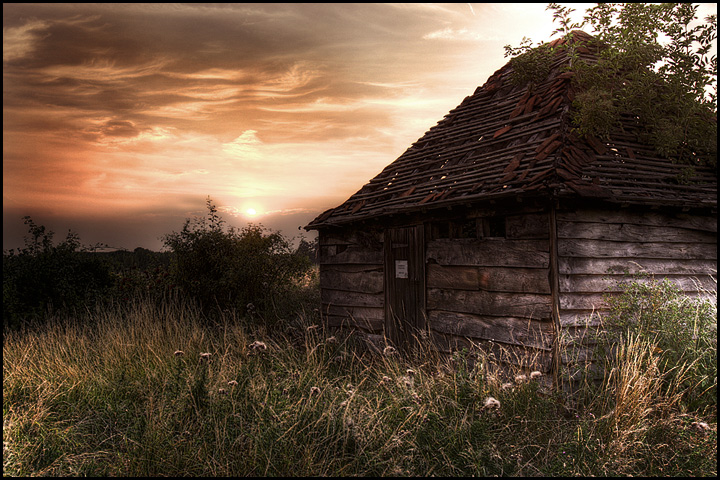
I see two shots which I can't pick out as user Falc's and this is one of them. Though the style and mood reminds me more of Heida's fairytale cottage. Please don't fret and I hope you take that as big compliment if you're not Falc ;)
The tones are excellent and I like how you brought out the texture of the weathered wood. Good luck with this one. Wouldn't be surprised to see this in the top10. |
|
|
|
08/07/2008 04:03:24 PM |
|
|
|
08/06/2008 05:38:33 PM |
|
This is so "Heida" to me... (Except it's probably warmer in light & tones than her work tends to be.) Fantastic processing and an exceptional transformation from the ordinary to the extraordinary. 9 |
|
|
|
08/06/2008 07:50:50 AM |
|
Nice PP on the cabin. The two bushes to the left of the cabin are a bit dark compared to the foreground, and enough to make me wonder how the foreground of this image is lit. Still a good study in weathered! |
|
|
|
08/06/2008 07:46:48 AM |
|
nice HDR look about it...I really love the tones...crop is a little tight but works OK...8 |
|
|
|
08/05/2008 06:32:30 AM |
|
Nicely done to bring out the detail in the wood, the isolation of the scene. One wonders what may be on the sign on the door. |
|
|
|
08/04/2008 06:33:10 PM |
|
Awesome photo! very well edited, great detail in the Cabin and a wonderful sky. Love the bits of light coming through the roof. Lots of nice sightlines to let you read this photo. Very well done. The best I have seen so far! Best of luck. Scott |
|
|
|
08/04/2008 03:55:21 PM |
|
|
|
08/03/2008 04:37:35 PM |
|
You're a maestro, whoever you are! |
|
 Photographer found comment helpful. Photographer found comment helpful. |
|
|
08/02/2008 04:43:49 PM |
|
wow, that is really beautiful sunset. the house just completes the whole look, i really love old houses |
|
|
|
08/02/2008 04:34:52 PM |
|
The subject is quite dull - there's no interest in the picture for me. |
|
| Photographer found comment helpful. |
|
|
08/02/2008 09:47:26 AM |
|
love this shot...I love the colour and processing. great print |
|
|
|
08/02/2008 08:43:02 AM |
|
A feeling of the country, with this fine image....... |
|
|
|
08/02/2008 05:37:49 AM |
|
Great composition and lovely foreground colors. I wonder if taking the same image from a slightly lower position, so that the sun is somewhat hidden by the leaves, would have improved it even more (to say it differently, I am not fond of the direct sun highlights). (Not voting). |
|
|
|
08/01/2008 11:27:40 PM |
|
Gorgeous - -like heaven! 10! |
|
|
|
08/01/2008 03:04:58 PM |
|
If only you would have used a selective color adjustment layer in your processing to make the reds redder and the yellows more yellow, you would have an excellent photo |
|
|
|
08/01/2008 01:02:43 AM |
|
Home -
Challenges -
Community -
League -
Photos -
Cameras -
Lenses -
Learn -
Help -
Terms of Use -
Privacy -
Top ^
DPChallenge, and website content and design, Copyright © 2001-2026 Challenging Technologies, LLC.
All digital photo copyrights belong to the photographers and may not be used without permission.
Current Server Time: 07/01/2026 03:47:18 PM EDT.