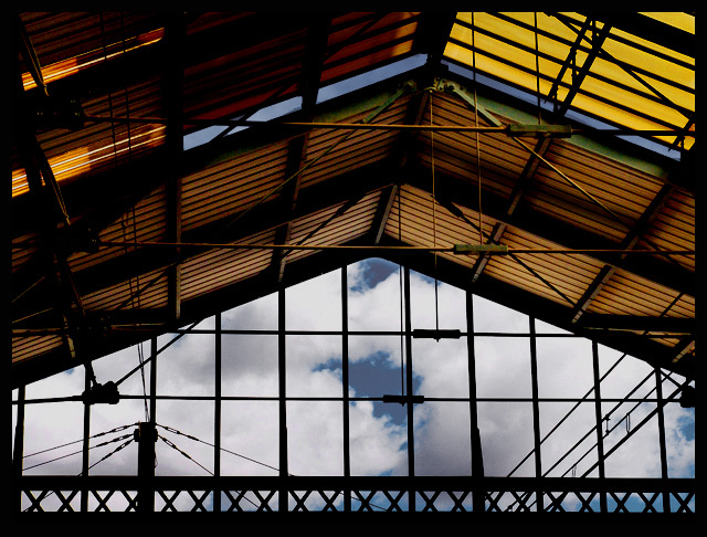
Some beautiful colours and lines here. I think the sky doesn't quite do it for me though... this picture could be stunning with the right sky. The exposure is very effective leaving just the right amount of shadow detail.
Lovely work, especially pleasing in its balance of colours and tones - complementary blue and orange are almost always effective. The definition in the steelwork creeping out from the silhouette is tremendous. I sense, beyond anything I could explain exactly, something missing though here - really couldn't say what.
There's not much emphasis on on the subject which is supposed to be outside the window (the clouds in this case). The great looking roof grabs the attention here.
I like the play of all the lines, but my eye's are more drawn to the brighter yellow piece in top. I probably would have cropped that out. The bigger blue sky parts look artificially darkened...more gray than blue & not matching the smaller areas along the bottom. Too much use of burning tool? Don't know what program you use, but adjusting in the selective color adjustments in Photoshop might do a more natural job & effect all the blue areas uniformly.
This would have been a great parallel lines entry!





 Add photograph to your favorites
 Add photographer to your favorites


 Photographer found comment helpful.


