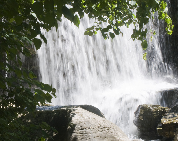
Color Saturation and Hue: Colors are accurate and not over saturated.
Brightness and Contrast: Shadows hold nice detail, but hightlight areas, especially where the water cascades over the rock, are blown out and featureless.
Focus and depth of field: Focus is nice and sharp. Depth of field is appropriated for this subject.
I think you already know what killed your score. It isn't a light bulb. Personally I don't vote ones for not meeting challenge, but you can see how many there are that do. Take heart from the ones who voted at the other end, and voted how they liked the image independent of the challenge subject.
I like the way you used the branches to frame the waterfall. A nice touch. The slower exposure to give the water a motion blur worked well too, and it is not so long that that it gives it the overworked cliche of the smokey foggy effect.
You may have won the brown ribbon, but you did it with a pretty nice picture.
Having a bright boulder front and center takes away from the main subject of the image. Getting a bit closer might eliminate the bright rock, display more of the waterfall advantageously, and allow the green leaves framing it to take less room and have a more subdued role. It probably is a wonderful place, but having this in the Light Bulb challenge looks like a mistake (if so, please accept my sympathy -- it would be nice to have a way for the site council to approve withdrawal of such mistakes; if not an error, I'll be interested in learning the connection to the topic).





 Add photograph to your favorites
 Add photographer to your favorites


