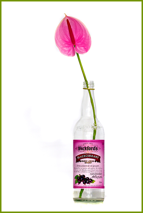
Nice and simple..Not sure if you can see it on your screen, but I can see some dark spots to the left of the bottle, where it looks like the white hasn't been brightened enough maybe?..
I see it too and it likely did hurt your score a bit. If I crank the brightness all the way down, it looks like this. I use the brightness extremes to test for stuff like that since I have been hit by th same issues in past challenges.
Yaaaay Lisa you are back in challenges...amd what a way to come back.
Love this high contrast image and the nice subtle take on the challenge. Great colours and I love the way the flower and the bottle label 'match'. Equally good is the way you match the border and the stem
Just a touch more dodging in the left side an you nailed it.
(the downside of having a calibrated monitor here)
Not sure I care for the border on this, but I don't vote on the borders.
Nice and simple..Not sure if you can see it on your screen, but I can see some dark spots to the left of the bottle, where it looks like the white hasn't been brightened enough maybe?..




 Add photograph to your favorites
 Add photographer to your favorites

 Photographer found comment helpful.


