Critique Club Review:
Color Saturation and Hue: N/A (image is monochrome)
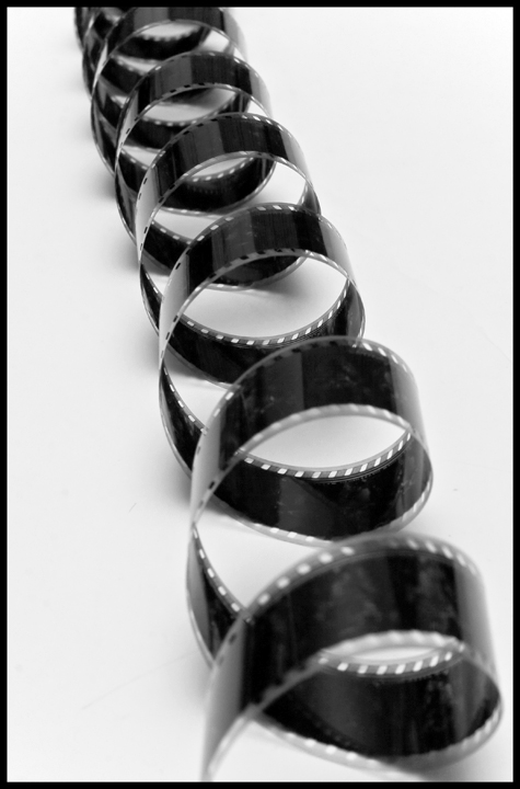
Brightness and contrast: Brights are not overly bright. Darks could be a little darker. Nice inky blacks would have worked well here. I do like the shadows on the foam core, it gives dimension to the piece.
Focus and depth of field: Focus is good, depth of field is a little shallow. The foregound and background both go a little soft. I see your fstop was at 14, I don't know how much more you had left. Perhaps a little greater distance from the subject could have helped increase the depth of field. As this image comes across as an abstract shape, with no real beginning or end, I think that the depth of field is a little more critical here.
A nice interesting take on the challenge. Turning the spiral into your "line" worked very well. |







 Add photograph to your favorites
 Add photographer to your favorites

 Photographer found comment helpful.


