You were wondering why this didn't do better. Well, there are some things I can add that might be the reason.
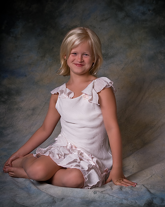
First off, the lighting on the girl is fine! Point of view might be a little higher. Her pose is a little forced, also her smile. The background isn't something of my taste (I always think this is a typical American background, but I love black ad white backgrounds ;)) and it's wrinkeled. If you place the model a bit forward, away from the BG, it will get more out of focus and I think that works better.
Well these are some things that come to mind. Not saying it's the truth, but just my humble opinion ;)
nice studio image, lovely girl, beautiful smile...I am not a fan of this type of backdrop. I think it has been used too much and might be a little old now, but lighting and her innocence comes through 7
Beautiful child & neat pose. I would try to get less shadow on the BG to the right. Perhaps a smaller aperture to start blurring the details of the canvas?
The lighting on her is even, however the background is too distracting. Shoot her further away from the drapes in a shallower DOF. It will give almost a bokeh feeling and it will make her stand out more.







 Add photograph to your favorites
 Add photographer to your favorites

 Photographer found comment helpful.


