| Author | Thread |
|
|
04/14/2004 07:31:22 AM |
I suffered similarly when I tried a technique similar to this in the "Portrait" challenge.
Don`t worry about it keep experimenting.
Gordon |
|
Comments Made During the Challenge  |
|
|
04/13/2004 10:24:48 PM |
|
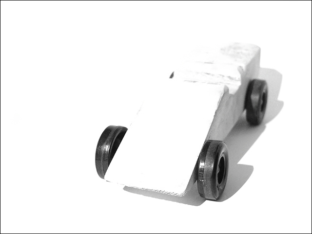
Way overexposed, and your age is showing. :) |
|
|
|
04/13/2004 09:01:40 PM |
|
I didn't really like the over blown-ness of the image. Very hard to look at. |
|
|
|
04/12/2004 04:34:36 PM |
|
|
|
04/12/2004 03:52:49 PM |
|
THE WHITE IS BLINDING ME! |
|
|
|
04/12/2004 10:49:38 AM |
|
was this your intended exp.? |
|
|
|
04/11/2004 05:37:19 PM |
|
white over white.... not impresive at first look. Like something is missing. |
|
|
|
04/11/2004 04:13:06 AM |
|
Wheels are perfectly exposed (at least 3 of 4) but the choice on the car is a little too much white for my taste. |
|
|
|
04/11/2004 02:19:29 AM |
|
|
|
04/10/2004 10:01:48 PM |
|
i like the over exposure-i'm sure you'll recieve a lot of comments about disliking the brightness, but i really think it works. |
|
|
|
04/10/2004 08:04:59 PM |
|
over exposed... and unbalanced and the title...? |
|
|
|
04/10/2004 06:29:02 AM |
|
exposure++, but doesn't quite work for me sorry.. 5 |
|
|
|
04/09/2004 05:17:15 PM |
|
I get the concept you were going for yet I find it to blown out(highlights) |
|
|
|
04/08/2004 03:43:48 PM |
|
There isn't enough contrast. I would have picked a different background color. |
|
|
|
04/08/2004 01:01:18 PM |
|
badly overexposed I guess you want the wheels to be the focal point, but I'm almost blinded by all that white in the center. A different color car that would be a shade of gray may help |
|
|
|
04/08/2004 12:49:55 PM |
|
I don't like the washed out look to this image. the wheels totally stand out, but the image is so stronge and bright that I can't look at it long. |
|
|
|
04/08/2004 11:00:10 AM |
|
|
|
04/08/2004 02:15:58 AM |
IMHO This is too high key. It doesn't have enough detail to sit up and say 'hey'...
TC |
|
|
|
04/08/2004 01:10:52 AM |
|
|
|
04/07/2004 11:58:46 PM |
|
|
|
04/07/2004 09:22:22 PM |
tell me if i'm wrong but is this a cub car??
I made one of these in scouting
cool high key image |
|
|
|
04/07/2004 06:14:25 PM |
|
Oh man, this one is too bleached out. I think the all-white with black wheels is a good idea, but the black wheels aren't really black, and don't seem to have much texture. If you could have done that, I think the shot might have played out better. Maybe a more interesting angle and cropping on the car as well could have helped it. |
|
|
|
04/07/2004 02:41:26 PM |
|
too bright. more than half the frame is blown out. I realize that the wheels are the main subject but the car fills much more of the visual plane and since it is featured, it should be well rendered. |
|
|
|
04/07/2004 12:11:06 PM |
|
whoaa..back the ccamera up about 3 stops and try again - way over exposed. |
|
|
|
04/07/2004 09:51:38 AM |
|
Very overexposed, did you do that on purpose? Would have been nice to see the texture on the wood. |
|
Home -
Challenges -
Community -
League -
Photos -
Cameras -
Lenses -
Learn -
Help -
Terms of Use -
Privacy -
Top ^
DPChallenge, and website content and design, Copyright © 2001-2026 Challenging Technologies, LLC.
All digital photo copyrights belong to the photographers and may not be used without permission.
Current Server Time: 06/28/2026 11:38:14 AM EDT.