Author Thread
Post actions
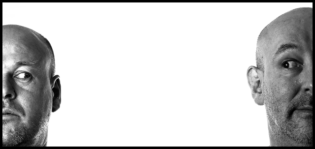
Both of your expressions are simply hilariously perfect. The lighting is different on your faces , perhaps why it scored lower? the space between you two works well for me though. As does that your heads dont align. Adds to the comedic aspect of the shot.
Post actions
well you hit a 6 mate, underated IMHO the models are very sexy and that might of affected the male voters
Comments Made During the Challenge
Post actions
Post actions
the overall sharpness of your image makes it stand out.
Post actions
Post actions
Looks like a movie poster :-) I Like it 9
Post actions
Great picture, one of my favorites in this challenge, I hope it gets a ribbon 8/10, but I wish their head were even...
Post actions
Post actions
Very nice concept indeed, let down a little by the poorer lighting on the subject on the right. But I like this one too much to let that bother me.
Post actions
Post actions
Post actions
Great concept for a shot - shame about the burned out area of the LHS forehead.
Post actions
Very nice job, love the idea, and a great job with the lighting, 8
Post actions
i know it was part of the shot, but there is too much space between the two subjects. and i wish the man on the right had light on his face too, too even out the balance
Post actions
Post actions
Nice to see this creativity amongst a sea of snapshots! 8
Post actions
Interesting shot, well executed.





 Add photograph to your favorites
 Add photographer to your favorites

 Photographer found comment helpful.


