| Author | Thread |
|
|
05/21/2008 05:35:01 PM |
|
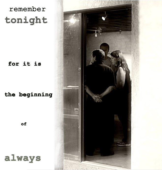
I think the text is a bit better than the other. This does have a greeting card feel to it, and the view through the open door is inviting and makes me want to go in and join the fun. Well done, Alicia. |
|
 Photographer found comment helpful. Photographer found comment helpful. |
|
|
05/15/2008 10:30:51 AM |
|
I prefer the other edit, lol. This one just doesn't fit the "story" I assigned to it. |
|
| Photographer found comment helpful. |
|
|
05/13/2008 09:31:08 PM |
|
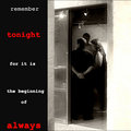
I do like the processing with the border and script better here. It does make it seem a bit more ominous. |
|
| Photographer found comment helpful. |
|
|
05/13/2008 09:29:06 PM |
|
... or even a little more ominous than that - something you might post up in department stores to prevent shoplifting. |
|
| Photographer found comment helpful. |
|
|
05/13/2008 03:25:21 AM |
|
Oh yeah - I can see that! |
|
| Photographer found comment helpful. |
|
|
05/12/2008 04:54:30 PM |
i actually preferred the red & white on black .. but they are definitely my colours .. this is great too of course .. !! .. just different and more muted ... :)
Message edited by author 2008-05-12 16:55:36. |
|
| Photographer found comment helpful. |
Home -
Challenges -
Community -
League -
Photos -
Cameras -
Lenses -
Learn -
Help -
Terms of Use -
Privacy -
Top ^
DPChallenge, and website content and design, Copyright © 2001-2026 Challenging Technologies, LLC.
All digital photo copyrights belong to the photographers and may not be used without permission.
Current Server Time: 07/03/2026 12:15:19 AM EDT.