| Author | Thread |
Comments Made During the Challenge  |
|
|
04/06/2004 11:58:34 PM |
|
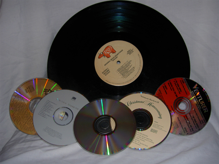
Good idea, but the dim light and obviously staged composistion hurts you. |
|
 Photographer found comment helpful. Photographer found comment helpful. |
|
|
04/05/2004 09:59:01 AM |
Not very interesting composition
|
|
| Photographer found comment helpful. |
|
|
04/05/2004 02:01:10 AM |
|
A bit dark and the writing seems out of focus. Nice idea. |
|
| Photographer found comment helpful. |
|
|
04/02/2004 03:06:37 PM |
|
The lighting appears to be dark throughout. |
|
| Photographer found comment helpful. |
|
|
04/02/2004 12:22:34 PM |
|
| Photographer found comment helpful. |
|
|
04/01/2004 07:16:04 PM |
|
Good idea, nicely laid out. I think it would have been better to move them away from the background, then you could have used shalllow DOF. And try to make the base of the backdrop also "disappear" out of the forefront of attention. |
|
| Photographer found comment helpful. |
|
|
04/01/2004 05:24:13 PM |
|
|
|
04/01/2004 08:30:58 AM |
|
The idea is ok, to be honest it just looks like a snapshot. |
|
| Photographer found comment helpful. |
|
|
04/01/2004 03:15:31 AM |
|
a bit dull and slightly out of focus? could have been cropped tighter |
|
| Photographer found comment helpful. |
|
|
03/31/2004 09:04:56 PM |
|
All of them seem out of place on the bedsheet, which is not a great backdrop here. Picture is a bit dark. |
|
| Photographer found comment helpful. |
|
|
03/31/2004 10:03:58 AM |
|
The idea is good and meets the challenge. Firstly, the image seems a little small, remember you can go 640 pixels on the longest side, which can help with the details in the image. The wrinkles in the fabric and the fact that it is so close to the other elements makes the background become an element in the shot. A way to avoid that is to make sure the foreground elements are not leaning against or too close to the background. The image also looks underexposed, which an adjustment with levels or curves in an editing program could have helped with. |
|
| Photographer found comment helpful. |
|
|
03/31/2004 09:52:22 AM |
|
the large record is very much out of place amongst the cd's and the drop sheet in the background surely got my attention. |
|
| Photographer found comment helpful. |
|
|
03/31/2004 07:40:41 AM |
|
i had a similar idea. This pic is underexposed and the composition is uninteresting. also, not evenly cropped (top too tight) |
|
| Photographer found comment helpful. |
|
|
03/31/2004 12:51:03 AM |
|
The lighting is not bright enough. The sheets need ironing too. Nice idea though. |
|
| Photographer found comment helpful. |
Home -
Challenges -
Community -
League -
Photos -
Cameras -
Lenses -
Learn -
Help -
Terms of Use -
Privacy -
Top ^
DPChallenge, and website content and design, Copyright © 2001-2026 Challenging Technologies, LLC.
All digital photo copyrights belong to the photographers and may not be used without permission.
Current Server Time: 06/29/2026 01:20:49 AM EDT.