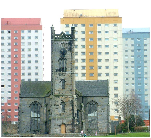
Unfortunately, the weather played a large part in the washing out effect as the sky was light grey , featureless and overcast.The church in the foreground was underexposed..and I had to perform a bit of a balancing act to try to equalise things.
Didn`t notice the tilt at time of submitting, however, when I had a go at straightening the image..with the church level..the flats took a lean to the right...I think the problem lies in the fact that the church is not parallel with the flats but at a slight angle.
Kept the figures in the shot to show scale, (pleased that some voters appreciated that).
What really makes this work for me is not the buildings themselves, but the tiny people at the bottom. They add a great sense of perspective to the pic, and give you an idea of how big the buildings really are. 9/10
I think if you had metered this alittle better so that the sky wasn't so burnt I believe it would have turned out better, or maybe even come back at a different time of day, later in the evening perhaps, but I do like the idea, also I would have wated for the people to get out of the picture, but that's me being anal
almost very good except I would have removed the figures and ground and tried to increase the contrast between the blocks and the sky...they look too washed out at the moment
Effective challenge entry. I like the geometrical parallels between church and high rises. The photo is a bit washed out though. I'd like to have seen more saturated colours - this is down to the overcast conditions though which i guess you might not have been able to do much about!
Excellent, excellent photo. The right angles and gray/light color combinations work very well. And I like how the textures and styles of the two buildings are so different, yet very similar at the same time, with their pastel colors and blocky shapes. My top score for the week.
I wish you had stepped it back a bit. The grass hillock on the rightis a nice common groung for the old and new and I wish it had been carried under the whole frame to balance the sky. This IMHO would have made what is alreaqdy a good shot better.
This shot could have been so much better. The image looks a little over exposed and the people in the shot are very distracting. I personally would love to see this shot at sunrise or twilight with lights on in the tower blocks. A bit of a missed opportunity for me then 4/10
Wonderful idea and well framed. If only the sky weren't totally blown out. Also, there is a slight tilt to the right. While you seem to be perfectly aligned on the left, the right shows the angle. This is all the result of shooting upwards toward the buildings.






 Add photograph to your favorites
 Add photographer to your favorites

 Photographer found comment helpful.


