| Author | Thread |
Comments Made During the Challenge  |
|
|
04/06/2004 01:26:47 PM |
|
|
|
04/06/2004 11:15:52 AM |
|
|
|
04/06/2004 10:43:47 AM |
|
Good angel and technically well done though it probably would have tolerated lite more colorsaturation and contrast. |
|
|
|
04/06/2004 10:34:48 AM |
|
hahahaha...thanks for the laugh. |
|
|
|
04/06/2004 01:29:23 AM |
|
Having the main subject in the middle is usually a no-no but here it seems to work. |
|
|
|
04/05/2004 11:27:07 PM |
|
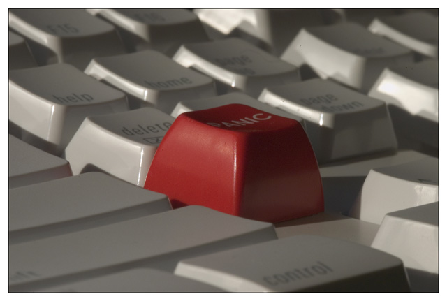
If only I had a "panic" button on my computer! Nice picture. |
|
|
|
04/05/2004 05:58:01 AM |
|
|
|
04/05/2004 03:50:10 AM |
|
A better perspective and lighting would have helped a lot. Hard to read 'Panic' |
|
 Photographer found comment helpful. Photographer found comment helpful. |
|
|
04/03/2004 07:16:25 PM |
nice as colours.... but i don't find it out of place
i like the light |
|
|
|
03/31/2004 05:27:49 PM |
|
I have a keyboard like that. well framed . I think the light might be smoother as those shadows on the numerical keys are distracting. |
|
| Photographer found comment helpful. |
|
|
03/31/2004 04:55:38 PM |
|
I need to get one of those buttons. Nicely done. I might have cropped the panic button more to the left so it wouldn't be so centered, but it is still good. |
|
| Photographer found comment helpful. |
|
|
03/31/2004 12:35:34 PM |
|
IMHO, it would have worked better without so much gray and shadow--make the keys whiter to bring out contrast. Whiter keys would make the red one even more stunning. Good picture over all. |
|
| Photographer found comment helpful. |
|
|
03/31/2004 09:37:22 AM |
|
ORIGINAL...VERY original!!! |
|
Home -
Challenges -
Community -
League -
Photos -
Cameras -
Lenses -
Learn -
Help -
Terms of Use -
Privacy -
Top ^
DPChallenge, and website content and design, Copyright © 2001-2026 Challenging Technologies, LLC.
All digital photo copyrights belong to the photographers and may not be used without permission.
Current Server Time: 06/28/2026 11:30:51 AM EDT.