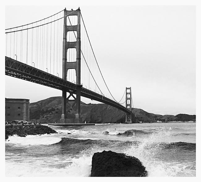
a.k.a The "San Francisco Golden Gate Bridge on the DPC get-to-gether". I like the old look of this but it isn't my fav. To see the rest of the shots from the gtg as well as some fellow DPCers go here SF GTG my portfolioor here DPC SF GTG thread
Normally I think I like colour shots of the GGB due to the rich red tones in the structure, but actually in this case, probably due to the overcast dull weather, I believe the B&W is preferable. Good composition.
The view from Fort Point is one of my favorites of the bridge. Spent many an hour there in my teens, and really liked the windy days when the waves come in and send the spray flying.
I like the perspective, and think the rich tones in the bridge, and the hills are very good. I have some very fond memories of Sausolito from the late 60's, but unfortunately haven't spent much time in San Francisco since. What a great place!
A good solid composition to show off this architectural masterpiece. I prefer it in B&W given the lack of interest in the sky in color. Here the starkness suits your composition.
Somehow the Golden Gate Bridge always seems to remind me of a commercial from years ago, "Rice-a-roni,...the San Francisco treat!" (O, and sorry! I know you'll be singing that tune all day.) Great Photo, BTW! :)
I love the perspective, but for me the colour photo works better - love that kind of weather for shooting colour - and I believe distinguishes and harmonizes the elements of the picture to a greater degree. I find this interesting because I usually prefer black and white.
This is the Hitchcock (Kim Novack) spot. I've been there ar few times and always get a chill when I'm there and even when I see a picture of it. Brrrrr.




 Add photograph to your favorites
 Add photographer to your favorites


 Photographer found comment helpful.


