| Author | Thread |
|
|
04/16/2008 12:06:17 AM |
|
 Photographer found comment helpful. Photographer found comment helpful. |
Comments Made During the Challenge  |
|
|
04/15/2008 11:21:40 PM |
|
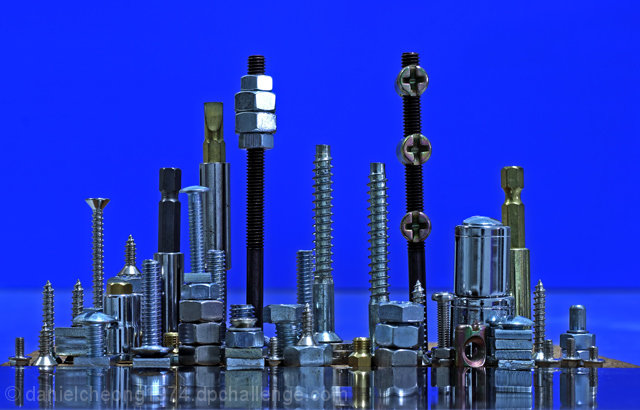
Great idea. Silhouette (which was also done in this challenge) would have taken attention away from the textures on the hardware. |
|
| Photographer found comment helpful. |
|
|
04/15/2008 10:01:46 PM |
|
Creative and interesting. |
|
| Photographer found comment helpful. |
|
|
04/15/2008 03:50:15 PM |
|
Interesting. I personally wonder how this might look with a less bold background...but overall this is pretty good. |
|
| Photographer found comment helpful. |
|
|
04/14/2008 10:03:05 PM |
|
| Photographer found comment helpful. |
|
|
04/13/2008 06:11:47 PM |
|
Nice and sharp, good range of objects and heights to illustrate the concept well. |
|
| Photographer found comment helpful. |
|
|
04/12/2008 09:59:22 AM |
|
This shot is nicely done. The idea is original, and is executed very well. |
|
| Photographer found comment helpful. |
|
|
04/11/2008 10:27:01 AM |
|
Good idea i really like the background and its interesting to look at |
|
| Photographer found comment helpful. |
|
|
04/11/2008 10:17:45 AM |
|
I've seen one of these already, but that doesnt shift my opinion. I reaaly like this, my only complaint is the background make it a little bland. |
|
| Photographer found comment helpful. |
|
|
04/11/2008 01:36:29 AM |
|
Great arrangement and use of different shaped materials. |
|
| Photographer found comment helpful. |
|
|
04/10/2008 11:30:45 PM |
|
Cute cityscape. I like how the light that reflects off of the one building make it look like a lit up building at night. |
|
| Photographer found comment helpful. |
|
|
04/10/2008 12:07:43 PM |
|
Fourth one so far in this challenge, I like 'em all! |
|
| Photographer found comment helpful. |
|
|
04/10/2008 10:16:53 AM |
|
A little bit more "land" would give you a better idea of an island. I see a hint to the right and a tiny bit to the right of center near the back. |
|
| Photographer found comment helpful. |
|
|
04/10/2008 08:57:56 AM |
|
well done, i like how you thought about it and added little extras onto the nuts and blots, well done 9 |
|
| Photographer found comment helpful. |
|
|
04/09/2008 10:03:28 PM |
|
Good idea; nicely composed. |
|
| Photographer found comment helpful. |
|
|
04/09/2008 07:14:02 PM |
|
well placed nuts and bolts - one of the better nuts and bolts shots |
|
| Photographer found comment helpful. |
|
|
04/09/2008 02:45:57 PM |
|
A few of these in the challenge, it will be interesting to see which one comes out on top. This is very good. |
|
| Photographer found comment helpful. |
|
|
04/09/2008 01:47:42 PM |
|
Nutty cityscapes seem to be popular. This one is nicely done with good lighting and composition. Nice clean background too. |
|
| Photographer found comment helpful. |
|
|
04/09/2008 12:29:14 PM |
|
teeny bit of glare but hard to fault otherwise! |
|
| Photographer found comment helpful. |
|
|
04/09/2008 10:10:43 AM |
|
a fantastic idea and a perfect interpretation for the challenge...8 |
|
| Photographer found comment helpful. |
|
|
04/09/2008 10:01:48 AM |
|
I saw another nuts and bolts thing |
|
| Photographer found comment helpful. |
|
|
04/09/2008 08:32:02 AM |
|
Not enough depth, something behind wold have helped the impression of a skyline |
|
| Photographer found comment helpful. |
|
|
04/09/2008 08:15:27 AM |
Good job, the lighting on my work PC screen does not seem as harsh as you mentioned, in fact I would like a little more contrast to make the nuts & bolts stand our a little more from the background.
Background too flat with 1 solid color, Need some gradations.
Definitely need a more reflection to add more interest
Hell of a good effort IMO. |
|
| Photographer found comment helpful. |
|
|
04/09/2008 06:16:53 AM |
|
Some depth - another row of nuts and bolts for example - would really lift this. Still damn good though! |
|
| Photographer found comment helpful. |
|
|
04/09/2008 05:07:26 AM |
|
not so good attempt at copying Carl Warners shot. Structures are not as realistic, horizon is placed wrongly, light is too flat. to me this looks rather like a pile of screws and bolts than a cityscape |
|
| Photographer found comment helpful. |
|
|
04/09/2008 04:59:51 AM |
|
Original and very creative! |
|
| Photographer found comment helpful. |
|
|
04/09/2008 03:02:08 AM |
|
I think I would have liked to have seen a little more of the reflection of your "city" |
|
| Photographer found comment helpful. |
|
|
04/09/2008 12:27:04 AM |
|
clever but i think less would have been more in this instance 6 |
|
| Photographer found comment helpful. |
Home -
Challenges -
Community -
League -
Photos -
Cameras -
Lenses -
Learn -
Help -
Terms of Use -
Privacy -
Top ^
DPChallenge, and website content and design, Copyright © 2001-2026 Challenging Technologies, LLC.
All digital photo copyrights belong to the photographers and may not be used without permission.
Current Server Time: 07/01/2026 05:10:23 PM EDT.