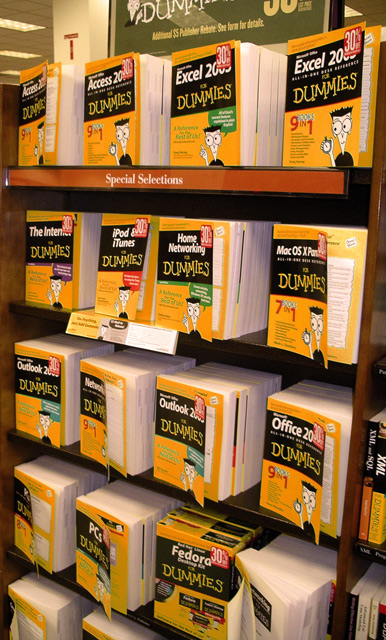
I really would have prefered a tighter horizontal crop, maybe just "The Internet" through "Office 200_" to remove the two signs on top. The color seems off though, since I own some dummies books, I can vouch for their being yellow and not orange, so that doesn't sell me on this picture at all. Score: 4
WB makes what I know are orange books look yellow on my screen. Lots of folks took other colored things and made them look orange, this is the first to do the opposite.
All the 'dummies' books i have seen are quite yellow. SOOO, i have to vote this one low as it is not an 'orange' pic. While the covers appear a bit on the orangy side to me in this pic, that is not their true color, so this is either improper white balance or editing parlor tricks. A bit of USM would help too.
What about photography for dummies. Maybe shoot from from the front and higher to get a better view of all front covers. Nice interpretation of the orange rule.




 Add photograph to your favorites
 Add photographer to your favorites


 Photographer found comment helpful.
