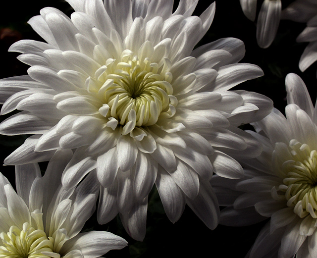
A very nice photo, with good composition and crisp focus. As a photographer, you should note that Flora Garten is a vertical format, and that it could be difficult to read type over an image with this much contrast. I do like the shot, though. I'll bet you could get a stunning cover photo with a really tight crop of the main flower that fills the entire page.
I would love to see this with a softer but brighter light source - kind of like some of the floral entries for 'painting with light.' Still a nice shot though. Good luck!
This is perhaps the best lighting of white that I have seen. The flatter yellow even compliments rather than having some high sat color...Great shot - I love it. The only thing, is the title right?
Very nice photo. I like the added DOF for this shot. I think that a little work to make the whites just a little whiter might make this one really pop.
Wow! This is an awesome shot. This is top quality and pitch perfect. I'm going to give you a high mark; however, you may find others will mark you down for having a horizontally cropped image instead of a vertically cropped image. IT seemed to be an issue in the last magazine challenge.







 Add photograph to your favorites
 Add photographer to your favorites


