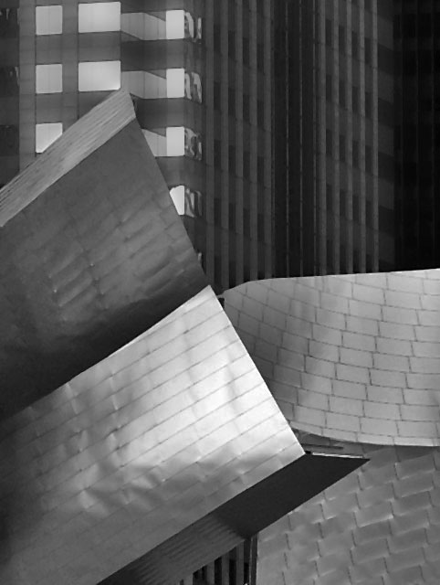
I get a feeling of designed chaos from this picture. All the textures and shapes are great. At first, I didn't like how the post processing flatened out all the details, but as I have looked, I can see how they add to the purely graphic presentation. I think a stark contrast would make this more graphic.
i really like your shot. the only thing that i could recommend, is possibly more tonal range. the composition is really nice. one of the better shots i've seen so far.
Is this Disney Hall? It's a bit grey. Need more whites and blacks in the photo. I think perhaps a brighter day or a longer exposure on an f22 aperature. :)
A nicely composed image which would work well as a cover because of the obvious space for magazine title towards the top. The strong glare/ reflection on the metallic foreground is the main negative for me.







 Add photograph to your favorites
 Add photographer to your favorites


 Photographer found comment helpful.


