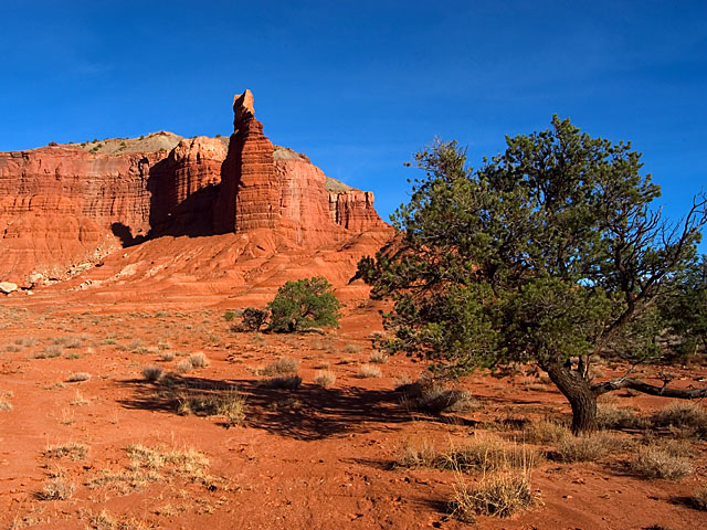
You have a nice shot here. I wonder how it would look if you shot not only in portrait mode, but also either at a time of day with lower sun, or some how positioning yourself differently to bring the tree more into the shot. Right now the tree seems to be more of a distraction than an addition. I think it may be due to the bushes clutter behind it on the right. It doesn't look so solitary out there. Your saturation is strong on this shot. Did you up that?
Shooting at this time of day can be tough. you did a fine job of portraying the landscape, I just think it'd be stronger with it composed differently to help bring the tree in, or out all together.
(I'm writing this to everyone who submitted a landscape shot) The challenge was to produce a shot worthy of a magazine cover but to me a shot like this is not suitable to be put on a "portrait" format magazine.
Beautiful colours though
---ADDITIONAL---
Due to forum discussions and accusations that marking landscapes down is nitpicking, I'm going through them and remarking. I still think some of the landscapes would not make good covers because of their orientation but I am no longer marking down because of that.
I still think landscape is inapropriate for the majority of magazines but I'll give the benefit of the doubt to the photographers.
Colours are just great, this is definately eye catching enough to be on any outdoor magazine. I think for this challenge the picture needs to be portrait - 8
Wow! This is an awesome shot. This is top quality and pitch perfect. I'm going to give you a high mark; however, you may find others will mark you down for having a horizontally cropped image instead of a vertically cropped image. IT seemed to be an issue in the last magazine challenge.





 Add photograph to your favorites
 Add photographer to your favorites


 Photographer found comment helpful.


