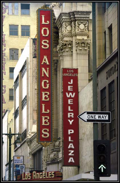
I like this street scene. I like the vertical lines of the two main signs, like the repetitive LA's, nice building detail, and I even like the arrows. I think you had a good eye for this one.
Great photo. The colors could be more vibrant though (contrast). I live 1 mile from here!!! The cropping is a bit tight on the left (or try to cut out the words all together for st. vincent)
Interesting composition. The two dominant red blocks help anchor the shot and the horizontal sign adds some zing to it. It looks a little soft, but that could be because of the resizing. I would have cropped out the part of the building in the background with the writting on it because the half letters distract from the composition.
I dont know this magazine so not sure if this is the standard thing in there. As an image it's a good blend of architecture and local interest. Bordering on too many elements, and as shot there wouldnt be much room to add title or blurbs without adding to the chaos, although I'm sure a magazine layout editor could do something with it. Good blend of colors, the details are not too bad, and the exposure is good.
Photo seems okay, but doesn't really grab me. A couple of things bother me... you need more depth of field, the signs in the background are blurred. And the vertical writing in the left of the frame distracts me as it looks like it has been unintentionally chopped in half. The arrows in your shot could have been used as a composition device to lead the eye to something of interest, but that doesn't really happen here.





 Add photograph to your favorites
 Add photographer to your favorites


 Photographer found comment helpful.


