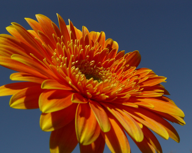
Rich orange color, though sky seems a little dull. Since DOF isn't shallow enough to focus on the center, I'd like to see the foreground petals in focus, too.
Oooh, I love the colors and the shapes. Nice shot! I find the shallow DoF here a little distracting though as the petals closest to us are out of focus. I would have rated it a little higher if it had been completely in focus. 8.
A very pretty flower. I would try to bring out more of the blue sky and saturate yellow and red about 15% to bring out more color in the flower. I'd give it a bit more brightness and contrast to make the flower stand out even more.
This flower is beautiful. The only thing I would do is maybe brighten up the blue sky, I'm not fond of the slate blue. However, this could be my monitor, so I'm not going to score down because of it.





 Add photograph to your favorites
 Add photographer to your favorites


 Photographer found comment helpful.


