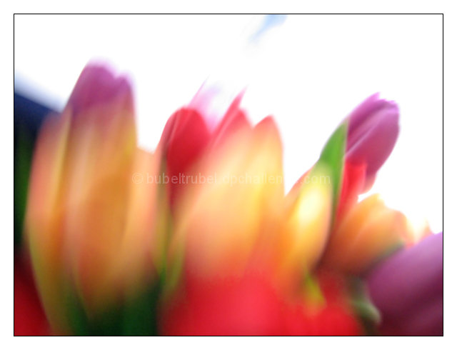
I live the colorful flowers in this and the blur. If you could have avoided the bright background, I think this would have been in the top 10. Nice as is though!
Lovely impression of tulips - this would make for a very appealing greeting card. I think the aslant white space in your framing of this image helps balance the composition. 10
soft focus and the colors give a peaceful feeling. For me there's too much white at the top of the photo. Filling the frame with color would have been more effective.
This is one of the best interpreations in this difficult challenge. I like it for 2 reasons: although it technically fulfills the requirements of blurry mess, it still is recognizable as a picture tulips. The colors picked and the arrangements scream loud SPRING IS COMING.






 Add photograph to your favorites
 Add photographer to your favorites

 Photographer found comment helpful.


