| Author | Thread |
|
|
03/21/2008 08:19:36 AM |
|
Thank you everyone for your critics. They have taught me to make a good examination of my photos. I will continue to submit... |
|
Comments Made During the Challenge  |
|
|
03/15/2008 09:10:34 PM |
|
|
|
03/15/2008 02:56:37 PM |
|
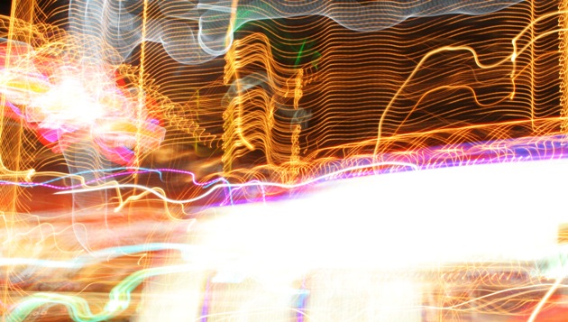
Brilliant! A little too much in the lower center and right. |
|
|
|
03/14/2008 05:04:32 PM |
|
I like the light play, but the big blown-out light in the middle almost kills it. |
|
|
|
03/13/2008 06:58:05 PM |
|
very vivid but too much glare in foreground |
|
|
|
03/13/2008 01:03:50 PM |
|
good to see you understood the challenge,seems most struggled with this challenge,except for the big blown out swath of white this rocks! mabe crop it out some...6 for "gettin it" |
|
|
|
03/12/2008 05:11:23 PM |
|
The lights work really well, nice photo |
|
|
|
03/12/2008 04:38:09 PM |
|
I'm not liking the large area of blowout very much, it would be better as accent, now it looks like subject. :( I do like the light trails, though, I'm thinking of a carnival. |
|
|
|
03/12/2008 02:02:42 PM |
|
These are always fun shots to take - you never really know what you have until you get home and look. This is a pretty good attempt, but the whited out part is a tad strong. |
|
|
|
03/12/2008 08:57:44 AM |
|
Good concept however, the big white section is a bit too distracting. The top half of the image is better IMHO |
|
Home -
Challenges -
Community -
League -
Photos -
Cameras -
Lenses -
Learn -
Help -
Terms of Use -
Privacy -
Top ^
DPChallenge, and website content and design, Copyright © 2001-2026 Challenging Technologies, LLC.
All digital photo copyrights belong to the photographers and may not be used without permission.
Current Server Time: 06/28/2026 03:05:39 AM EDT.